13 Introduction to Interactivity
13.1 Leaflet (Class Prep)
Leaflet is a useful tool to make interactive maps. It is powered by JavaScript but the R package leaflet lets us take advantage of many of its features. The purpose of this section is to show what kinds of interactive maps we can make with leaflet, but we will not learn all of the details or the customization options of the leaflet package.
The following code is slightly modified from a blog called Linear Fragility. The goal is to make a map of breweries across the United States that appear in https://thebeermonthclub.com/. The data comes from Kaggle and contains information on 2497 breweries across the United States.
Before we proceed to making the map, we note that, in the blog post, the writer mentions that he uses an R package on his GitHub site.
Not all R packages are submitted to CRAN and are readily installable. But anyone can write their own R package and not submit it to CRAN, which is where packages are stored that can be installed with install.packages().
A popular place to store such a package is a GitHub site: https://github.com/li-wen-li/uszipcodes. Packages on GitHub are not checked by anyone, so they may or may not actually work, but many are still reliable.
To install a package from GitHub, we can use the devtools package. The name_of_package::name_of_function() is syntax used when we want to denote the package that a particular function comes from. For example, we might use dplyr::filter() to let the reader of our code know that the filter() function is in the dplyr package.
Next, we can read in the beer data set:
Variables include the brewery_name, type, address, and state. But, you’ll notice that the beers data set does not include any spatial coordinates that give the locations of the breweries. There is, however, a variable called address: we will use the uszipcodes package to extract the zip code from the address variable so that we can map a brewery to its zip code.
raw_zip <- uszipcodes::get_zip(beers$address)
beers$Zip <- as.integer(uszipcodes::clean_zip(raw_zip))
When you run the code to add the variable Zip to the beers data set, you’ll notice that you’ll get a warning that there are some NA values that were introduced. The functions are not perfect: there are some zip codes that were not properly extracted from the address.
Finally, we join the zip codes, along with their latitudes and longitudes, to the beers data:
## only keep zip, lat, and long
zip_tab <- zip_table |> dplyr::select(Zip, Latitude, Longitude)
beer_location <- inner_join(beers, zip_tab)
beer_location
#> # A tibble: 2,327 × 9
#>   brewery_name     type  address website state state_breweries   Zip Latitude
#>   <chr>            <chr> <chr>   <chr>   <chr>           <dbl> <int>    <dbl>
#> 1 Valley Brewing … Brew… PO Box… http:/… cali…             284 95204     38.0
#> 2 Valley Brewing … Brew… 157 Ad… http:/… cali…             284 95204     38.0
#> 3 Valley Brewing … Micr… 1950 W… http:/… cali…             284 95203     38.0
#> 4 Ukiah Brewing C… Brew… 102 S.… http:/… cali…             284 95482     39.2
#> 5 Tustin Brewing … Brew… 13011 … http:/… cali…             284 92780     33.7
#> 6 Trumer Brauerei  Micr… 1404 4… http:/… cali…             284 94608     37.8
#> # ℹ 2,321 more rows
#> # ℹ 1 more variable: Longitude <dbl>
The next part of the code makes the content data set, which adds a variable called popup that contains the brewery website and name. This variable eventually contains the values the “pop up” on the map when we hover over a data point.
The remaining code comes from the leaflet package. As usual, it is helpful to run the code “pipe by pipe” to see what each piece is doing.
library(leaflet)

beer_map <- leaflet(beer_location) |>
  setView(lng = -98.583, lat = 39.833, zoom = 4) |>
  addTiles() |>
  addProviderTiles(providers$Esri.WorldGrayCanvas) |>
  addMarkers(lng = beer_location$Longitude, lat = beer_location$Latitude,
             clusterOptions = markerClusterOptions(),
popup = content$popup)beer_mapExercise 1. Why is inner_join() the most appropriate join function to use here in this example? What observations will an inner_join() get rid of from beers? from zip_tab?
Exercise 2a. Run leaflet(beer_location) |> setView(lng = -98.583, lat = 39.833, zoom = 4) and explain what the setView() function does.
Exercise 2b. Run leaflet(beer_location) |> setView(lng = -98.583, lat = 39.833, zoom = 4) |> addTiles() and explain what the addTiles() function does.
Exercise 2c. Run leaflet(beer_location) |> setView(lng = -98.583, lat = 39.833, zoom = 4) |> addTiles() |> addProviderTiles(providers$Esri.WorldGrayCanvas) and explain what the addProviderTiles() function does. You may also want to check out the help ?addProviderTiles.
Exercise 2d. Run leaflet(beer_location) |> setView(lng = -98.583, lat = 39.833, zoom = 4) |> addTiles() |> addProviderTiles(providers$Esri.WorldGrayCanvas) |> addMarkers(lng = beer_location$Longitude, lat = beer_location$Latitude) and explain what the addMarkers() function does.
Exercise 2e. Run the code in Exercise 2d, but add clusterOptions = markerClusterOptions() as an argument to addMarkers(). Explain what adding this argument does to the map.
Exercise 2f. Finally, run the code in Exercise 2e but add popup = content$popup as an argument to addMarkers(). Explain what adding this argument does to the map.
13.2 plotly Introduction
The plotly R package lets us modify a static (non-interactive) graph to become interactive. This is useful if we don’t have any one particular point that we want to highlight or label but we do want to allow the user to explore data that cannot be easily communicated on the plot. Like leaflet, plotly can be used in other software (Python, Julia, etc.) and can be used to make almost any plot interactive in this way.
To use plotly, we need to first install the package and load it (along with tidyverse) into our current R session:
Recall the Happy Planet Index data set, where we constructed a scatterplot of Wellbeing vs. carbon Footprint:
hpi_df <- read_csv(here::here("data/hpi-tidy.csv"))
ggplot(data = hpi_df, aes(x = Footprint, y = Wellbeing)) +
  geom_point() +
  theme_minimal()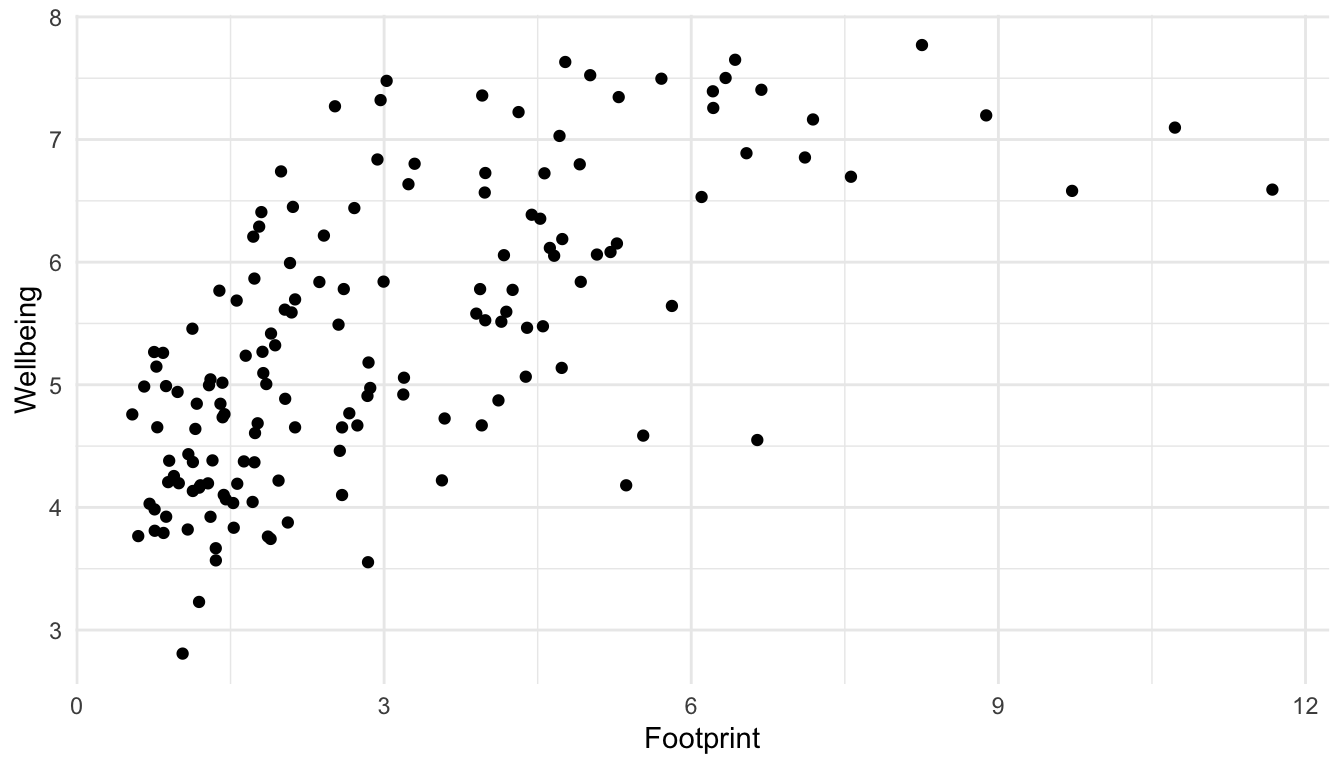
If we were interested in labeling 1 particular country, then we can do so with geom_text() or geom_text_repel(). But, if we want the user to be able to hover over any point in the scatterplot to see the name of the country, we can use plotly.
First, we assign out plot a name so that we can reference it with a plotly function. In this example, we name our plot plot1.
plot1 <- ggplot(data = hpi_df, aes(x = Footprint, y = Wellbeing)) +
  geom_point() +
  theme_minimal()
Then, we can use the ggplotly() function on our plot to make it interactive.
ggplotly(plot1)Simple! However, by default, plotly labels the points with their x and y values, not by another variable in the data set. We need to add a label aes() to our plot and then use the tooltip argument in ggplotly() to specify that points should be labeled by what we specified in the label aesthetic.
plot1 <- ggplot(data = hpi_df, aes(x = Footprint, y = Wellbeing,
                                   label = Country)) +
  geom_point() +
theme_minimal()ggplotly(plot1, tooltip = "label")Your plot should now be interactive and label the points by their country: sick! The syntax for ggplotly() might seem kind of odd now, but, because it’s consistent for all types of plots (specifying a label aesthetic and then using tooltip = "label"), it’s actually a pretty simple package to use!
Exercise 1. Using the penguins data set from the palmerpenguins package, create a simple bar plot of species. Then, use ggplotly on the bar plot.
Exercise 2. Use the ggplotly() function on the lollipop plot we made that showed the proportion of male (or female) students in particular majors. Then, modify the plot so that, when someone hovers over the point, the sample size is displayed.
Exercise 3. You can also remove hover info for particular items with the style() function. In particular, specifying hoverinfo == "none" for particular traces removes the hover info for those traces. Modify one of the following examples so that hover info is only displayed for the points (and not for the smoother or the standard error bar for the smoother).
plot_test <- ggplot(hpi_df, aes(x = Footprint, y = Wellbeing)) +
  geom_point() +
  geom_smooth()


ggplotly(plot_test) |>
style(hoverinfo = "none", traces = c(1, 2, 3)) ## remove hover info for all three tracesExercise 4. Use the ggplotly() function on any plot of your choice that we’ve made so far in the course or any plot that you’ve made for your blog. For this exercise, really try to think about a plot that would benefit from becoming interactive.
13.3 Your Turn
Exercise 1. What are some advantages of making a plot more interactive? What are some disadvantages of making a plot more interactive?