The purpose of this section is to apply some of the concepts from the Healy reading to graphs that we make in R. The code for each visualization is given here, but the code is not the focus for this particular section. Before we look at some visualizations in R, we will finish up the first chapter of the Healy book to introduce more fundamental visualization concepts.
3.1 More Data Visualization Concepts (Class Prep)
Read Sections 1.3 - 1.7 of Kearen Healy’s Data Visualization: A Practical Introduction, found here. As you read, answer the following questions in just 1 to 2 sentences.
What is the difference between a colour’s hue and a colour’s intensity?
Think of an example where you would want to use a sequential colour scale that’s different from the one given in the text. Then, think of examples where you would use a diverging colour scale and an unordered colour scale.
Some gestalt inferences take priority over others. Using Figure 1.21, give an example of a gestalt inference that takes priority over another one.
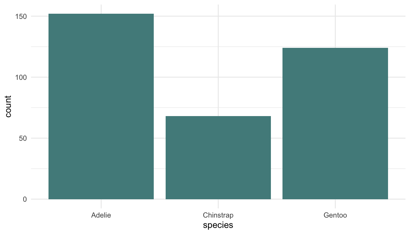
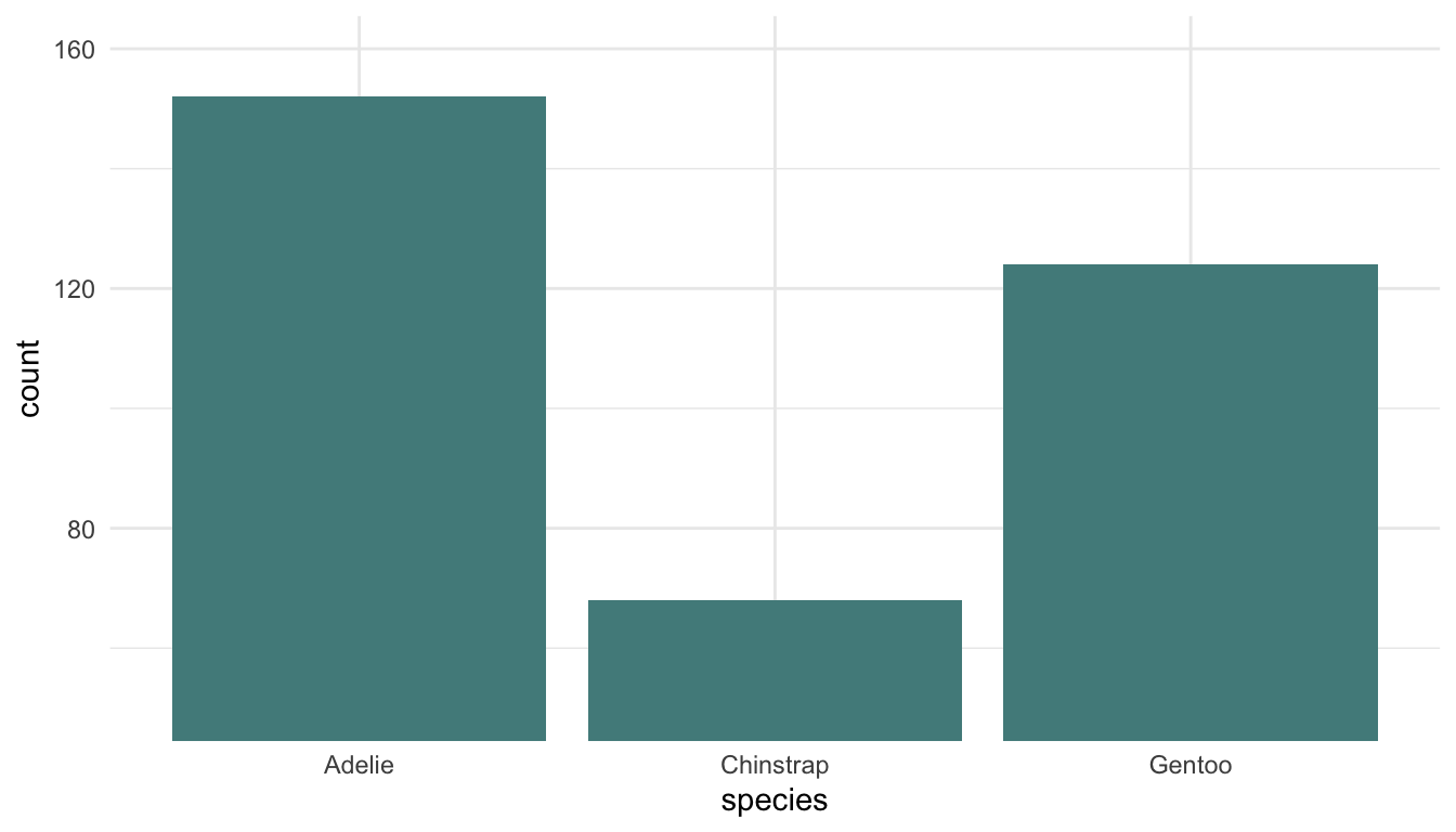
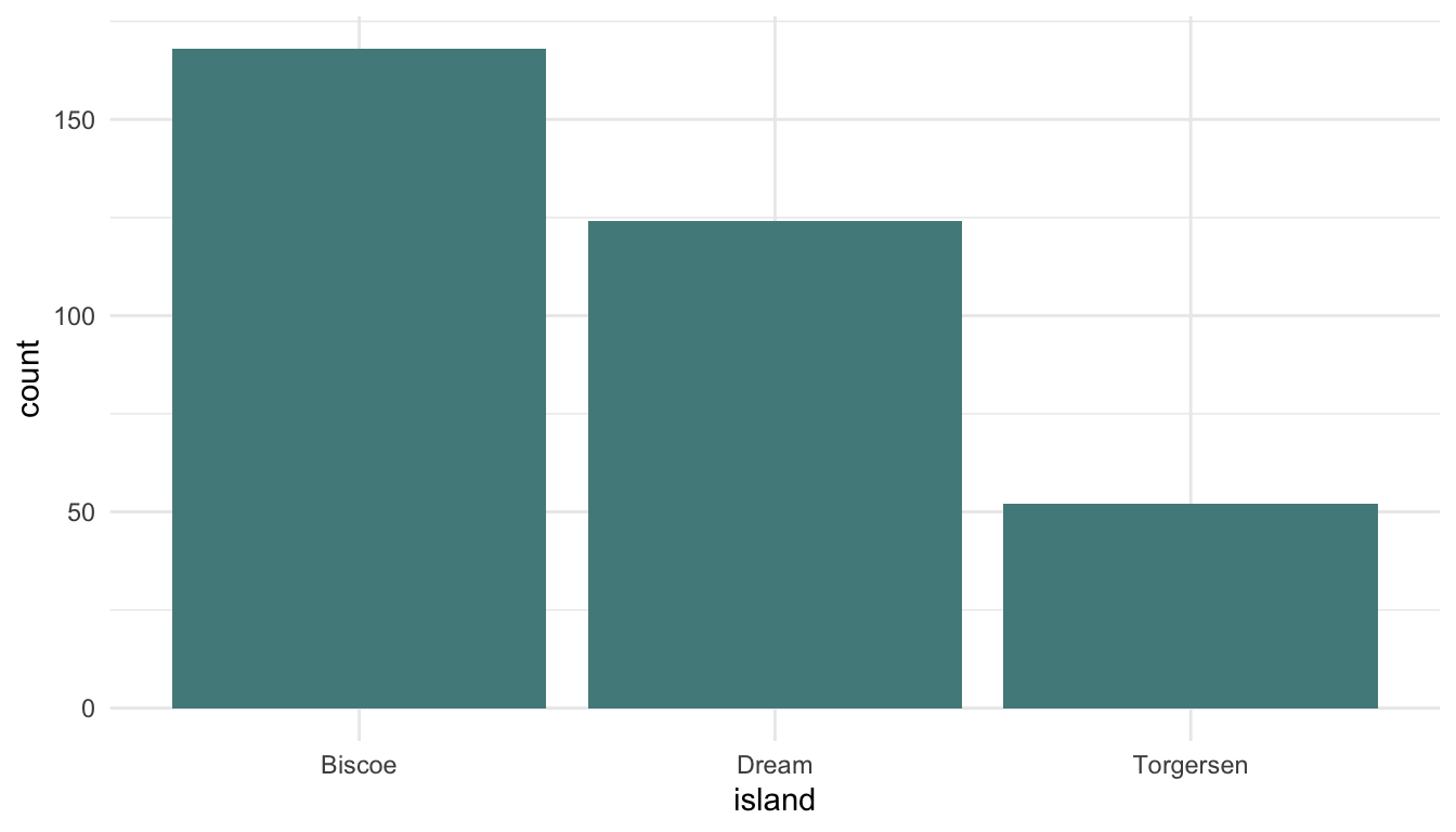
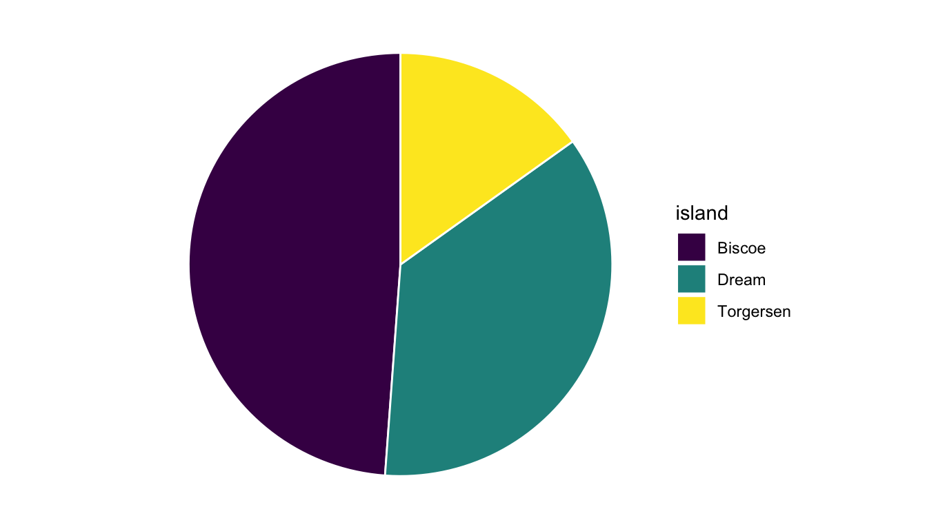
“Bar charts are better than Pie charts for visualizing a single categorical variable.” Explain how results shown in Figure 1.23 support this claim.
Suppose you have a scatterplot of height on the y-axis vs. weight on the x-axis for people born in Canada, Mexico, and the United States. You now want to explore whether the relationship is different for people born in the United States, people born in Canada, and people born in Mexico. Should you use different shapes to distinguish the three countries or should you use different colours? Explain using either Figure 1.24 or 1.25.
When might you use the left-side of Figure 1.27 to show the law school data? When might you use the right-side of Figure 1.27 to show the law school data?
Summary: What are two takeaways from Sections 1.3-1.7?
What is one question that you have about the reading?
3.2 Examples
We will examine pairs of visualizations. For each pair, we will (1) decide if there is a superior visualization for that context and (2) relate our decision, as much as possible, to the concepts from the Healy reading. These situations are certainly not meant to cover all scenarios you will run into while visualizing data. Instead, they cover a few common situations.
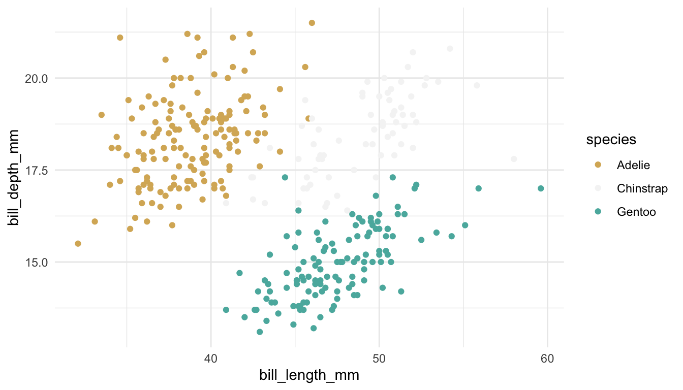
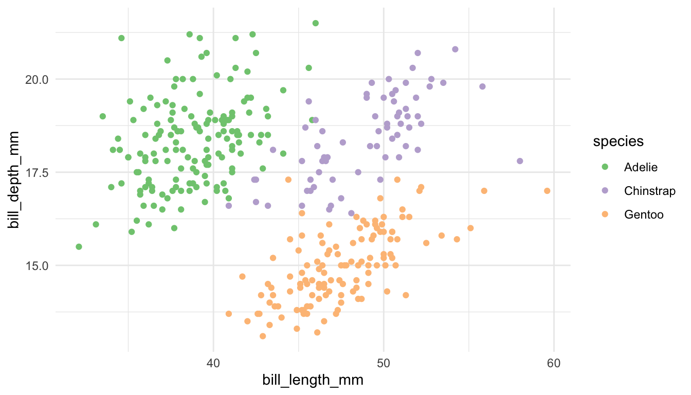
We will use the penguins data set from the palmerpenguins package. Each row corresponds to a particular penguin. Categorical variables measured on each penguin include species, island, sex, and year. Quantitative variables include bill_length_mm, bill_depth_mm, and body_mass_g.
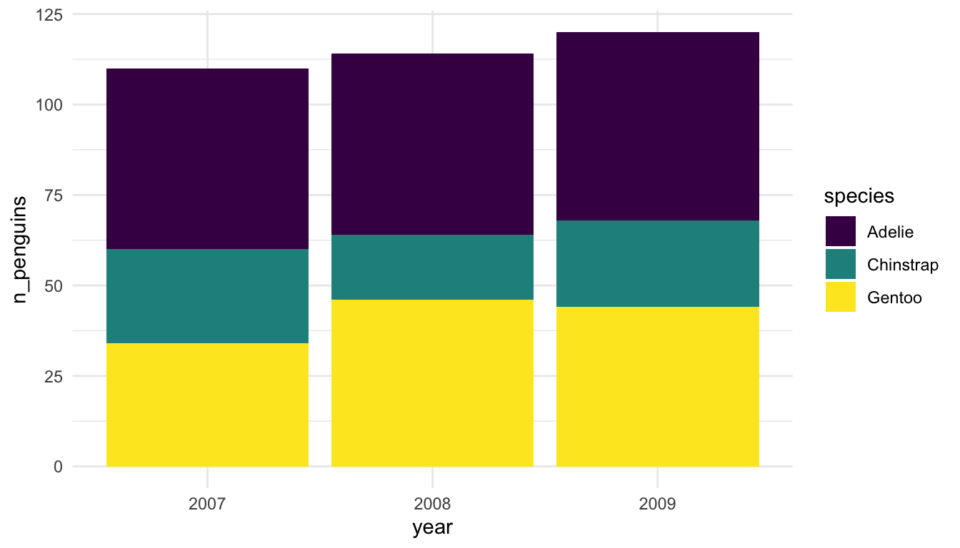
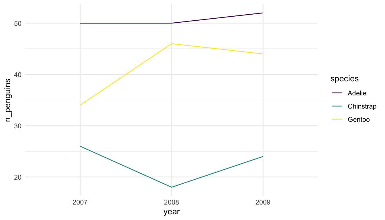
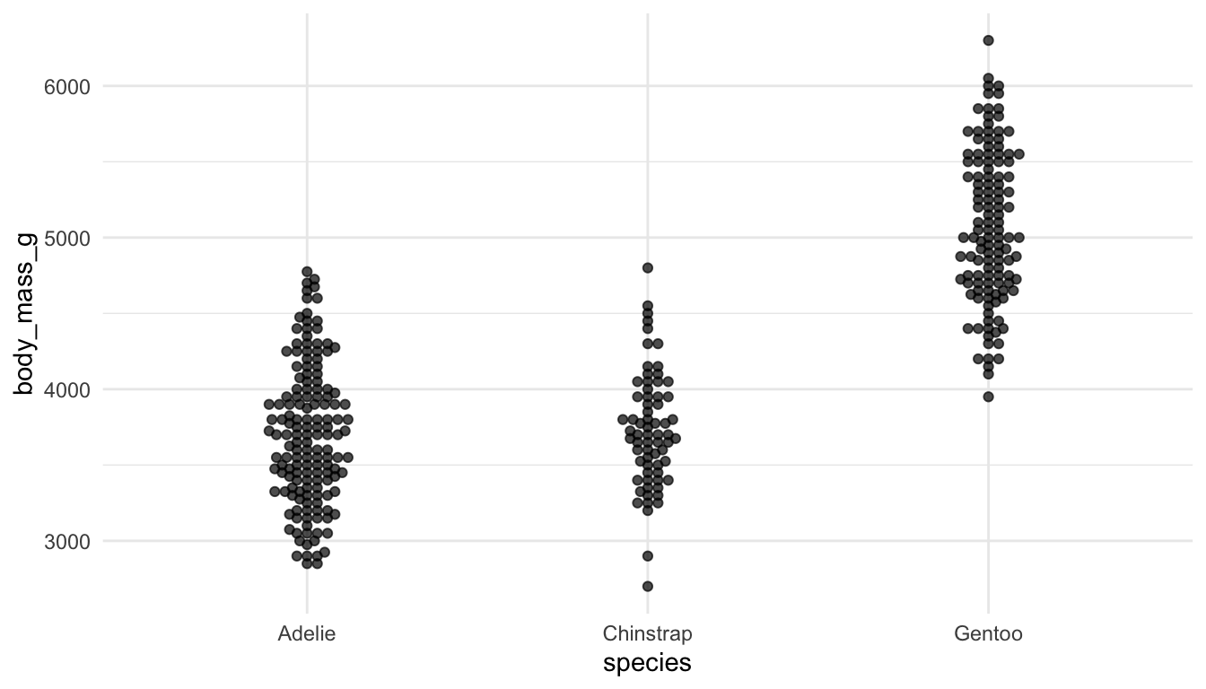
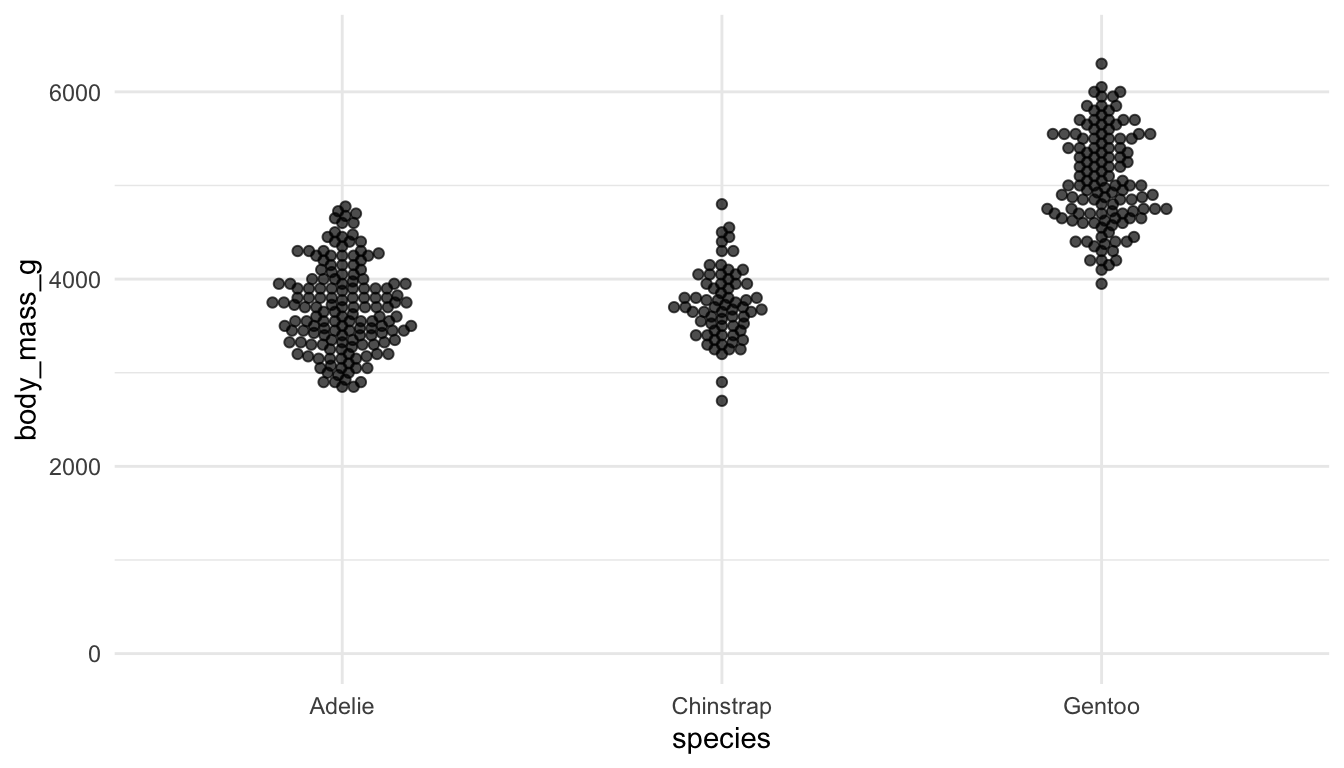
Example 1: Examine the following plots, which attempt to explore how many different penguins were measured in each year of the study for each species.
Which plot is preferable? Can you relate your choice to a concept in the reading?
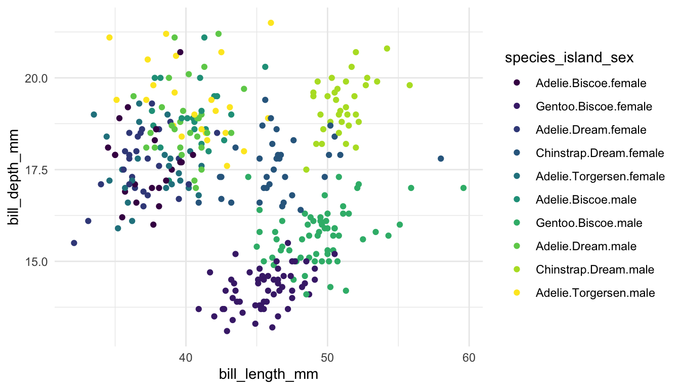
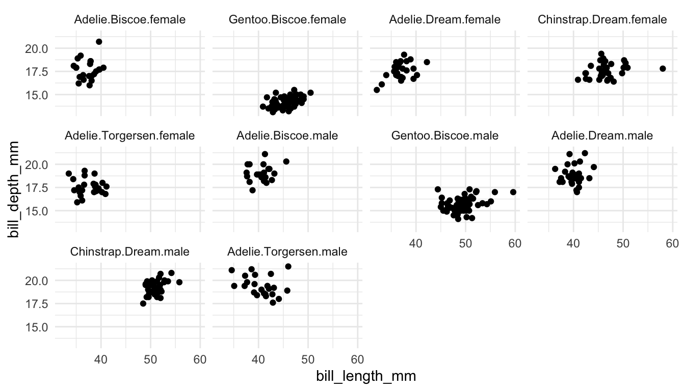
Example 4: The following plots explore whether to use colour or faceting to explore three (or more) variables in a data set.
TipTip
Whether you want to use colour or use faceting often depends on two things:
how many categories are there? The more categories, the better faceting is, in general.
how clumped are points within one category? If each category has nicely clumped points, colour works better, but, if there is a lot of overlap across categories, faceting generally works better.
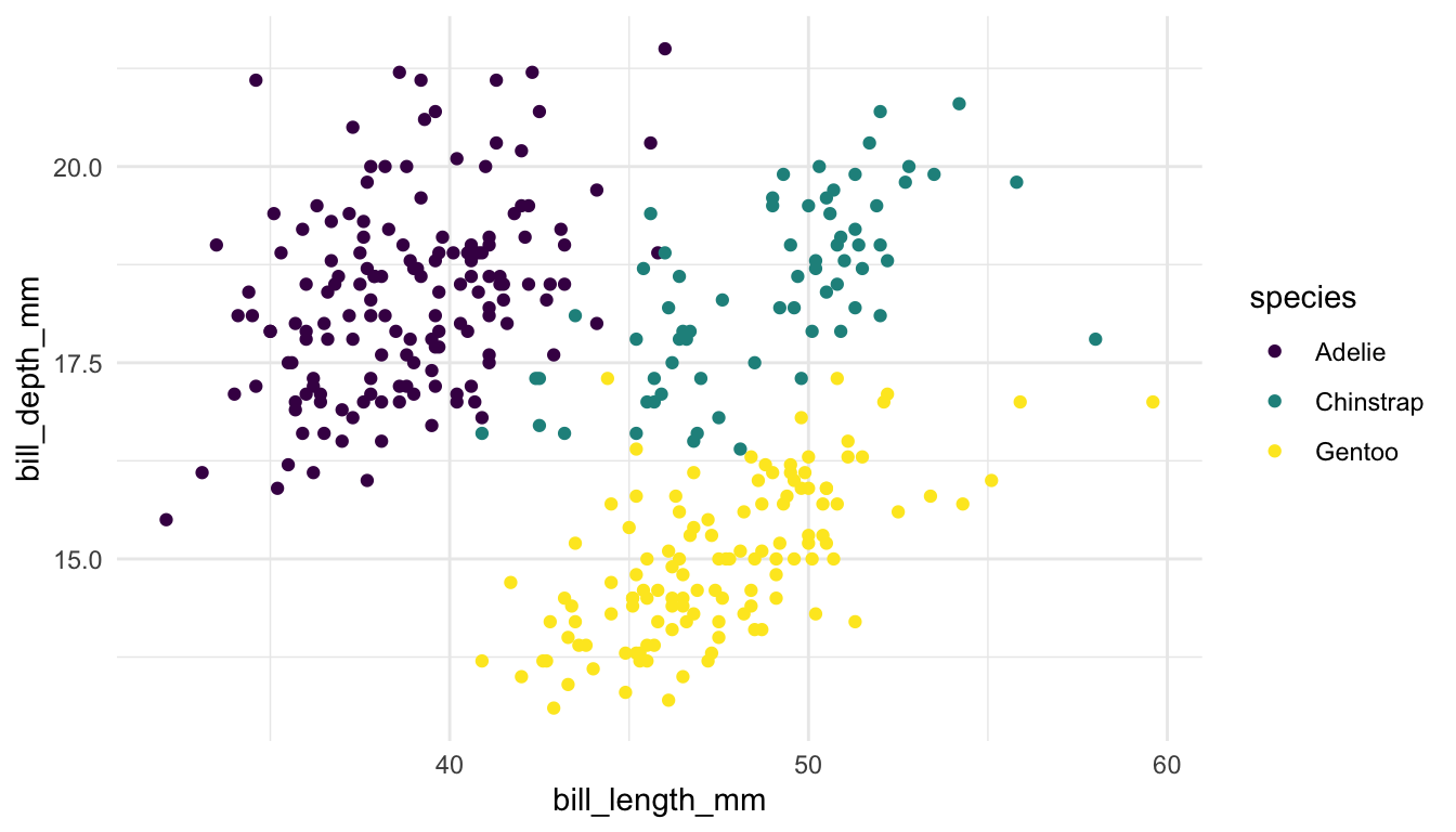
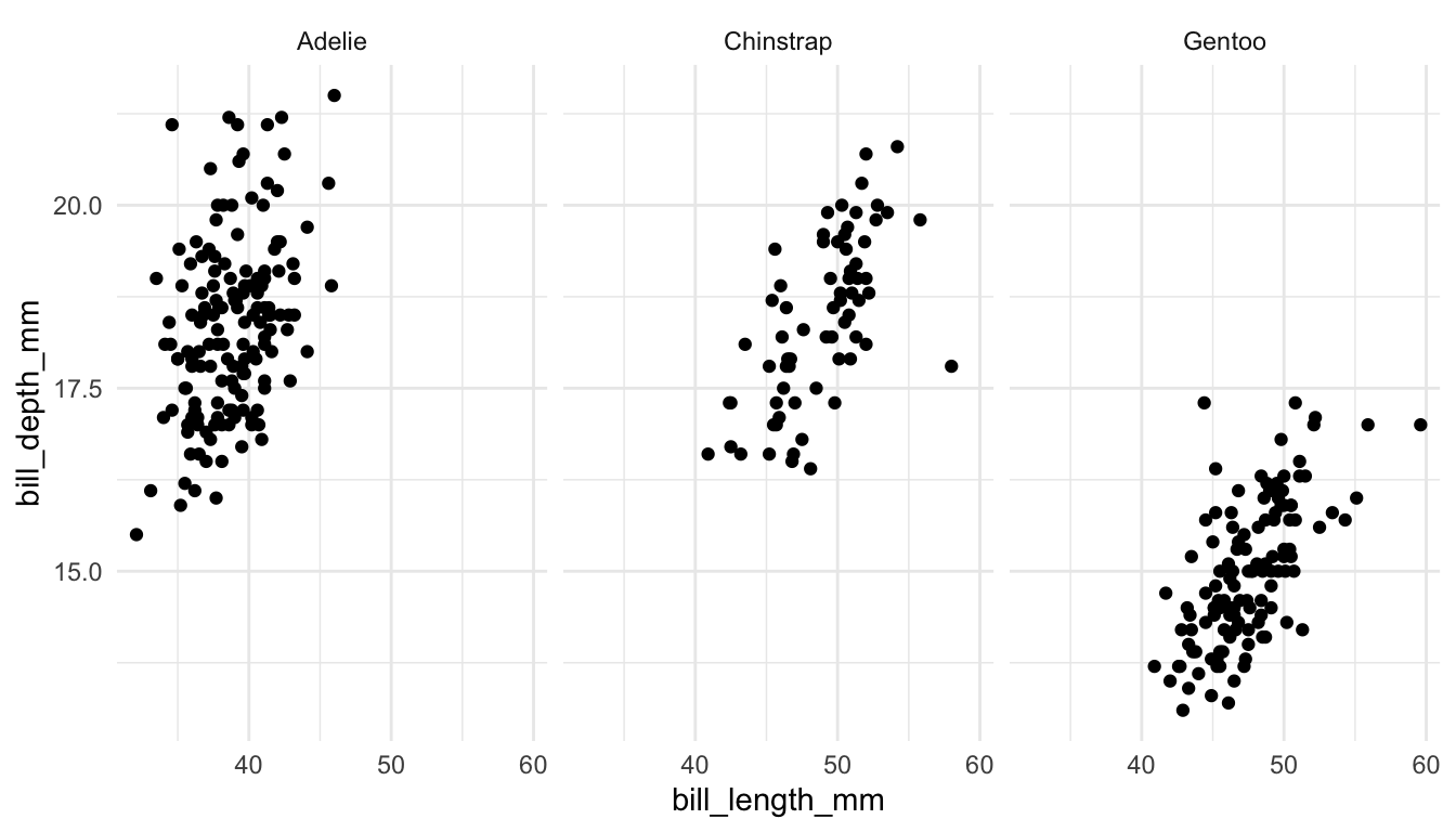
Pair 1. These plots are meant to explore the relationship between bill depth and bill length for each species of penguin.
Which plot is preferable? Can you relate your choice to a concept in the reading?
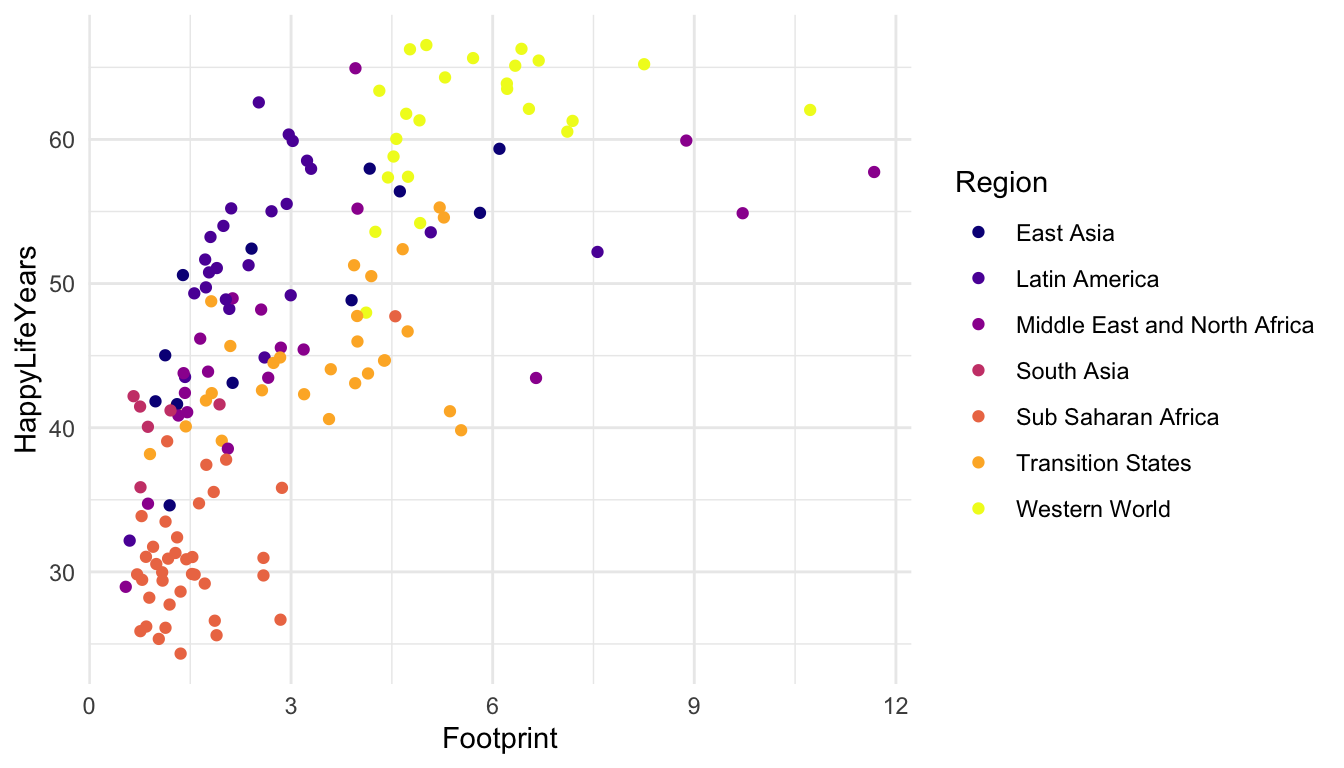
Example 6: Construct a couple of different plots using the Happy Planet Index data to explore whether there is a particular region of the world for which countries have a larger HappyPlanetIndex variable, a variable that is meant to measure how “happy” its citizens while taking into account how the average citizen from that country affects our planet.
A short description of the Happy Planet Index data is given below. The Happy Planet Index (HPI) is a measure of how efficiently a country uses its ecological resources to give its citizens long “happy” lives.
But, the basic idea is that the HPI is a metric that computes how happy and healthy a country’s citizens are, but adjusts that by that country’s ecological footprint (how much “damage” the country does to planet Earth). The data set was obtained from https://github.com/aepoetry/happy_planet_index_2016. Variables in the data set are:
HPIRank, the rank of the country’s Happy Planet Index (lower is better)
Country, the name of the country
Region, the area of the world the country is in
HappyPlanetIndex, our primary variable of interest, described above
Construct and examine each plot. Which plot is preferable? Might there be an even better plot to answer the question of interest?
Example 7: The final few examples discuss the choice of colour palettes when using colour in visualizations. We want to use our graphics to communicate with others as clearly as possible. We also want to be as inclusive as possible in our communications. This means that, if we choose to use colour, our graphics should be made so that a colour-vision-deficient (CVD) person can read our graphs.
NoteNote
About 4.5% of people are colour-vision-deficient, so it’s actually quite likely that a CVD person will view the graphics that you make (depending on how many people you share it with) reference here.
The colour scales from R Colour Brewer are readable for common types of CVD. A list of scales can be found here.
You’ve already read about different types of colour ordering in our course reading. We see some scales for each of the three categories (sequential, diverging, and unordered) in R Colour Brewer. You would typically use the top scales if the variable you are colouring by is ordered sequentially (called seq for sequential), the bottom scales if the variable is diverging (called div for diverging, like Republican / Democrat lean so that the middle is colourless), and the middle set of scales if the variable is not unordered and is categorical (called qual for qualitative like the names of different treatment drugs for a medical experiment).
For this example, which scale makes the most sense: seq, div, or qual? Why?
Another colour and fill scale package is the viridis package. The base viridis functions automatically load with ggplot2 so there’s no need to call the package with library(viridis). The viridis colour scales were made to be both aesthetically pleasing, CVD-friendly, and visible when printed to black-and-white. We’ve used the viridis colour scale in many examples already but another example is given below, in which the default option argument is changed to another scale called "plasma". The viridis colour scales can either be used as sequential colour scales or qualitative colour scales, but I do not believe they have any colour scales that would work well for diverging colours.
Exercise 3 We can also specialize the plot’s theme. There are a ton of options with the theme() function to really specialise your plot.
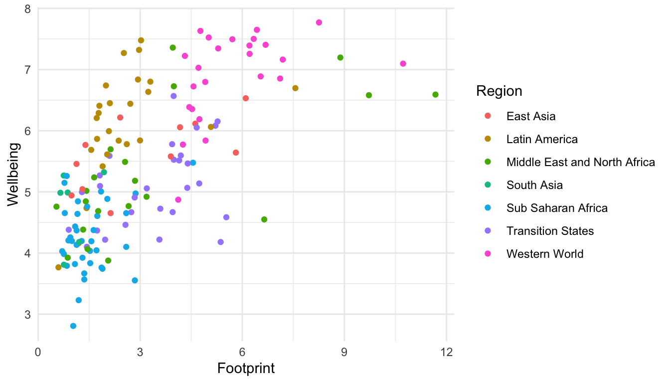
Consider the coloured scatterplot of the Happy Planet Index data:
ggplot(data =hpi_df, aes(x =Footprint, y =Wellbeing, colour =Region))+geom_point()
Using only options in theme() or options to change colours (scale_colour_manual()), shapes, sizes, etc., create the ugliest possible ggplot2 graph that you can make. You may not change the underlying data for this graph, and the final version of the graph must still be interpretable (e.g. you can’t get rid of or obstruct the points so much that you can no longer see the pattern). The goal here is to investigate some of the options given in theme() and the other scales, and to have a brief refresher on the structure and syntax of ggplot().