library(tidyverse)
library(here)
library(broom)
theme_set(theme_minimal())

titanic_df <- read_csv(here("data/titanic.csv"),
                       col_types = list(Pclass = col_factor())) |>
  mutate(Pclass = fct_recode(Pclass,
                             "1st" = "1",
                             "2nd" = "2",
                             "3rd" = "3"))
titanic_df
#> # A tibble: 891 × 12
#>   PassengerId Survived Pclass Name       Sex     Age SibSp Parch Ticket  Fare
#>         <dbl>    <dbl> <fct>  <chr>      <chr> <dbl> <dbl> <dbl> <chr>  <dbl>
#> 1           1        0 3rd    Braund, M… male     22     1     0 A/5 2…  7.25
#> 2           2        1 1st    Cumings, … fema…    38     1     0 PC 17… 71.3
#> 3           3        1 3rd    Heikkinen… fema…    26     0     0 STON/…  7.92
#> 4           4        1 1st    Futrelle,… fema…    35     1     0 113803 53.1
#> 5           5        0 3rd    Allen, Mr… male     35     0     0 373450  8.05
#> 6           6        0 3rd    Moran, Mr… male     NA     0     0 330877  8.46
#> # ℹ 885 more rows
#> # ℹ 2 more variables: Cabin <chr>, Embarked <chr>10 Logistic Model Visualization
The purpose of this section is to use visualization to give better model interpretations in the context of logistic regression. We will again use the overall strategy of model interpretation that we used in the previous section: interpreting the model by visualizing predictions from a grid of predictor values that we create.
10.1 Logistic Regression Review (Class Prep)
Recall that, if the response variable is categorical with only two levels, then we can fit a logistic regression model. Interpreting the coefficients of a logistic regression model, however, is more challenging than interpreting the fitted coefficients in a standard linear regression model. The interpretations rely on a statement about the multiplicative change in odds, which is generally not very intuitive.
In this section, we will review the overall logistic regression model, the interpretations of the fitted regression coefficients, and how to fit a logistic regression model in R.
We will use the titanic data set, obtained from Kaggle: https://www.kaggle.com/c/titanic/data. Each row of the data set is a passenger on the Titanic ship. The columns include:
-
Survived, a variable that is a1if the passenger survived the titanic shipwreck and a0if the passenger did not survive. -
Pclass, either1st,2nd, or3rdfor the class of the passenger’s ticket -
Sex, binary variable for sex of the passenger (maleorfemale) -
Age, age of the passenger (in years).
10.1.1 Review of Model
We will first consider a model with Survived as the response variable and Age as the predictor variable. The fact that Survived is a binary categorical variable means that standard linear regression would not be appropriate. Recall that, in logistic regression, we model the log-odds of survival:
\[ log\left(\frac{\pi}{1 - \pi}\right) = \beta_0 + \beta_1 Age, \]
where \(\pi\) is the probability that the passenger survived. Also, recall that the odds of survival are equal to \(\frac{\pi}{(1 - \pi)}\) so that odds are on a scale from 0 to Infinity. We can algebraically solve for \(\pi\) as:
\[ \pi = \frac{\text{exp}(\beta_0 + \beta_1 Age)}{1 + \text{exp}(\beta_0 + \beta_1 Age)}, \]
10.1.2 Fitting the Model
We can fit the model in R with the glm() function, which is very similar to lm(), except that there is an extra argument family to specify that we want to use the "binomial" to fit a logistic regression model.
titanic_mod <- glm(Survived ~ Age,
                   data = titanic_df, family = "binomial")
titanic_mod
#>
#> Call:  glm(formula = Survived ~ Age, family = "binomial", data = titanic_df)
#>
#> Coefficients:
#> (Intercept)          Age
#>    -0.05672     -0.01096
#>
#> Degrees of Freedom: 713 Total (i.e. Null);  712 Residual
#>   (177 observations deleted due to missingness)
#> Null Deviance:       964.5
#> Residual Deviance: 960.2     AIC: 964.2
The broom package functions augment(), tidy(), and glance() can also be used on models fit with glm():
titanic_mod |> tidy()
#> # A tibble: 2 × 5
#>   term        estimate std.error statistic p.value
#>   <chr>          <dbl>     <dbl>     <dbl>   <dbl>
#> 1 (Intercept)  -0.0567   0.174      -0.327  0.744
#> 2 Age          -0.0110   0.00533    -2.06   0.0397
We can also make a plot of the fitted model by using geom_smooth() with method = "glm":
ggplot(data = titanic_df, aes(x = Age, y = Survived)) +
  geom_jitter(height = 0.05) +
  geom_smooth(method = "glm", method.args = list(family = "binomial")) +
  theme_minimal()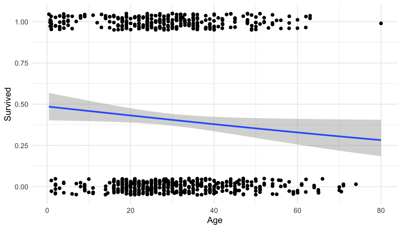
WarningWarning
We get a warning that 177 rows have been removed because we do not have Age data for 177 of the passengers.
We also see that the model predicts that older passengers tended to have a lower survival probability.
10.1.3 Interpreting Coefficients
We next interpret the coefficients from this simple logistic regression model. Because our interpretations involve explanations about odds, these coefficient interpretations are not particularly useful, especially to the general public who use the words “probability” and “odds” somewhat interchangeably (for statisticians, these are different things though!).
titanic_mod |> tidy()
#> # A tibble: 2 × 5
#>   term        estimate std.error statistic p.value
#>   <chr>          <dbl>     <dbl>     <dbl>   <dbl>
#> 1 (Intercept)  -0.0567   0.174      -0.327  0.744
#> 2 Age          -0.0110   0.00533    -2.06   0.0397
Because this model was linear on the log-odds scale, the interpretation of the -0.00261 value is linear on the log-odds scale: The model predicts that a one year increase in age is associated with a 0.00261 decrease in the log-odds of survival.
This interpretation is practically useless: what does it mean to have that amount decrease in log-odds of survival? If we take \(e^{-0.00261} = 0.997\), we can interpret the resulting value on the odds scale as a multiplicative change in odds. You likely discussed why you can do this in STAT 213 but we won’t focus on it again here. The resulting interpretation is something like “The model predicts that a one year increase in age is associated with a multiplicative change in the odds of survival of 0.997 times.” In other words, the model predicts that, for a one year increase in age, odds of survival are the predicted odds of survival of the previous year of age times 0.997.
Again, this interpretation is not particularly useful or effective. And, we are in the simplest possible case of logistic regression: a model with just one predictor! Interpretations are even more challenging when there are multiple predictors, interactions, squared terms, etc. The goal of the next section is to use visualization to help communicate model results from logistic regression.
Exercise 1. Fit a logistic regression model with Fare as a predictor. Obtain summary output with tidy() and use ggplot2 to construct a plot of the model.
Exercise 2. Fit a logistic regression model with Sex as the predictor. Make an attempt at interpreting the resulting fitted coefficient for Sex on either the log-odds scale or the odds scale (keeping in mind that Sex is categorical so your interpretation should be comparing odds of survival of female and male passengers).
10.2 Visualizing Logistic Regression Models
Warm Up Exercise. Jittering allowed us to see the data points on the logistic regression plot of Survival vs. Age earlier, but, another option, is to generate a rug plot with geom_rug(). Examine the link https://ggplot2.tidyverse.org/reference/geom_rug.html and modify the plot to have the “rug” tick marks on the top and bottom of the graph instead of the points.
To help communicate what a fitted logistic regression model means, in terms of predicted probability (as opposed to predicted odds or log-odds), we will again make use again of the ggeffects package. We will use the same overall strategy as the previous section on using ggeffects to visualize models from standard linear regression models.
Our basic strategy for visualizing models is to
fit the model with
glm().construct a grid of predictor values with the
ggpredict()function from theggeffectspackage.Obtain predicted probabilities for the response variable at the values specified in our grid using
ggpredict().Use
ggplot2to construct a meaningful plot with the predicted probabilities.
ImportantImportant
The only difference here compared to our strategy for standard linear models is that we want to make a plot of the predicted probability in logistic regression.
Suppose we fit a logistic regression model with Survived as the response variable and Age, Sex, and Pclass as predictor variables:
titanic_large <- glm(Survived ~ Age + Sex + Pclass, data = titanic_df,
                     family = "binomial")
titanic_large |> tidy()
#> # A tibble: 5 × 5
#>   term        estimate std.error statistic  p.value
#>   <chr>          <dbl>     <dbl>     <dbl>    <dbl>
#> 1 (Intercept)   1.20     0.253        4.74 2.19e- 6
#> 2 Age          -0.0370   0.00766     -4.83 1.36e- 6
#> 3 Sexmale      -2.52     0.207      -12.2  4.81e-34
#> 4 Pclass1st     2.58     0.281        9.17 4.76e-20
#> 5 Pclass2nd     1.27     0.244        5.21 1.92e- 7
NoteNote
Let’s take a moment to appreciate that interpreting these coefficients in terms of a multiplicative change in odds of survival would not be that informative.
We next use ggeffects to create a grid of predictors that we want to make predictions for and then obtain predictions at values in the grid:
library(ggeffects)
ggpredict(titanic_large, terms = c("Age", "Sex", "Pclass"))
#> # Predicted probabilities of Survived
#>
#> Sex: male
#> Pclass: 3rd
#>
#> Age | Predicted |     95% CI
#> ----------------------------
#>   0 |      0.21 | 0.14, 0.30
#>  20 |      0.11 | 0.08, 0.15
#>  40 |      0.06 | 0.04, 0.09
#>  80 |      0.01 | 0.01, 0.03
#>
#> Sex: male
#> Pclass: 1st
#>
#> Age | Predicted |     95% CI
#> ----------------------------
#>   0 |      0.78 | 0.63, 0.88
#>  20 |      0.63 | 0.51, 0.73
#>  40 |      0.44 | 0.36, 0.54
#>  80 |      0.15 | 0.08, 0.27
#>
#> Sex: male
#> Pclass: 2nd
#>
#> Age | Predicted |     95% CI
#> ----------------------------
#>   0 |      0.49 | 0.35, 0.63
#>  20 |      0.31 | 0.23, 0.41
#>  40 |      0.18 | 0.12, 0.25
#>  80 |      0.05 | 0.02, 0.10
#>
#> Sex: female
#> Pclass: 3rd
#>
#> Age | Predicted |     95% CI
#> ----------------------------
#>   0 |      0.77 | 0.67, 0.84
#>  20 |      0.61 | 0.53, 0.69
#>  40 |      0.43 | 0.33, 0.54
#>  80 |      0.15 | 0.06, 0.30
#>
#> Sex: female
#> Pclass: 1st
#>
#> Age | Predicted |     95% CI
#> ----------------------------
#>   0 |      0.98 | 0.95, 0.99
#>  20 |      0.95 | 0.92, 0.97
#>  40 |      0.91 | 0.86, 0.94
#>  80 |      0.69 | 0.52, 0.83
#>
#> Sex: female
#> Pclass: 2nd
#>
#> Age | Predicted |     95% CI
#> ----------------------------
#>   0 |      0.92 | 0.86, 0.96
#>  20 |      0.85 | 0.78, 0.90
#>  40 |      0.73 | 0.63, 0.81
#>  80 |      0.38 | 0.20, 0.59

preds_titanic_large <- ggpredict(titanic_large, terms = c("Age", "Sex", "Pclass")) |>
  as.data.frame(terms_to_colnames = TRUE) |>
  as_tibble()
We will complete the rest of this exercise as a class.
Exercise 1. Make a plot of the values of predicted that lets you explore how our predictors are associated with the survival on the Titanic.
10.3 Your Turn
Exercise 1. Add an Sex:Pclass interaction term to the previous model and fit the model with glm().
Exercise 2. Obtain model predictions for both the previous model (without the interaction) and the new model (with the interaction).
Exercise 3. Construct a graphic that shows how the two models differ.
Exercise 4. Which model is better? Use glance() on each model to obtain some model summary statistics and determine which model is the better “fit.”