1 Sampling Distributions
The purpose of this section is to investigate sampling distributions through statistical simulation. Before we dive into details, you should load in the tidyverse library, which we will use to make some plots and obtain some statistical summaries of samples.
Goals:
Given a population model for the simulation, construct the sampling distribution of any sample statistic (sample mean, sample median, sample maximum, etc.).
Explain how a change in sample size affects the center and spread of a sampling distribution.
Match properties of the simulated sampling distribution of the sample mean to the theoretical sampling distribution of the sample mean from MATH/STAT 325.
Lab 1.1: Introduction to Statistical Simulation
Starting a Simulation
To begin a simulation for a sampling distribution of a sample statistic, we need to choose:
a population model for the simulation. Let’s think about \(Y_i\) as a random variable for the amount of time Mipha spends at the office in a week (in hours) as our context. Then, let’s start by assuming that each \(Y_i\) follows the following model: Normal(\(\mu\) = 10, \(\sigma^2\) = 4). Additionally, \(Y_i\)’s from different weeks are assumed to be independent.
a sample size for the simulation. Here, Mipha wants to consider the amount of time she spends at the office in 5 randomly selected weeks of the year. So, let’s start with \(n\) = 5.
a calculation for the sample statistic that we are constructing the sampling distribution of. Here, Mipha wants to examine what the sample mean amount of time she spends at the office from 5 randomly selected weeks looks like. So, let’s start by using the sample mean, \(\bar{y}\).
Before we simulate anything, let’s use results from MATH/STAT 325 to report the theoretical distribution of the sample mean in the space below. Then, use this result to find the probability that the average amount of time Mipha spends at the office in 5 weeks is less than or equal to 9.5 hours per week and find the probability taht the average amount of time Mipha spends at the office in 5 weeks is more than 11 hours per week.
Generating a Single Sample Statistic
Carefully look through this code and output to understand the process of generating a single sample from a population and computing a statistic.
In the code below, we simulate five observations from a normal population with mean 10 and standard deviation 2. Note that, when you run the code, you should get a different set of 5 numbers than the ones printed below: it is a random sample, after all!
Next, we compute the sample mean from this sample: this is our sample statistic we are interested in.
# compute the sample mean
sample_mean <- mean(single_sample)
# look at the sample mean
sample_mean
#> [1] 10.336
Again, your sample mean should be different!
Finally, we can make a plot of our single sample, along with where the sample mean lies.
# generate a range of values that span the population
plot_df <- tibble(xvals = seq(mu - 4 * sigma, mu + 4 * sigma, length.out = 500)) |>
  mutate(xvals_density = dnorm(xvals, mu, sigma))

## plot the population model density curve
ggplot(data = plot_df, aes(x = xvals, y = xvals_density)) +
  geom_line() +
  theme_minimal() +
  ## add the sample points from your sample
  geom_jitter(data = tibble(single_sample), aes(x = single_sample, y = 0),
              width = 0, height = 0.005) +
  ## add a line for the sample mean
  geom_vline(xintercept = sample_mean, colour = "red") +
  labs(x = "y", y = "density",
       title = "Normal with Mu = 10 and sigma = 2")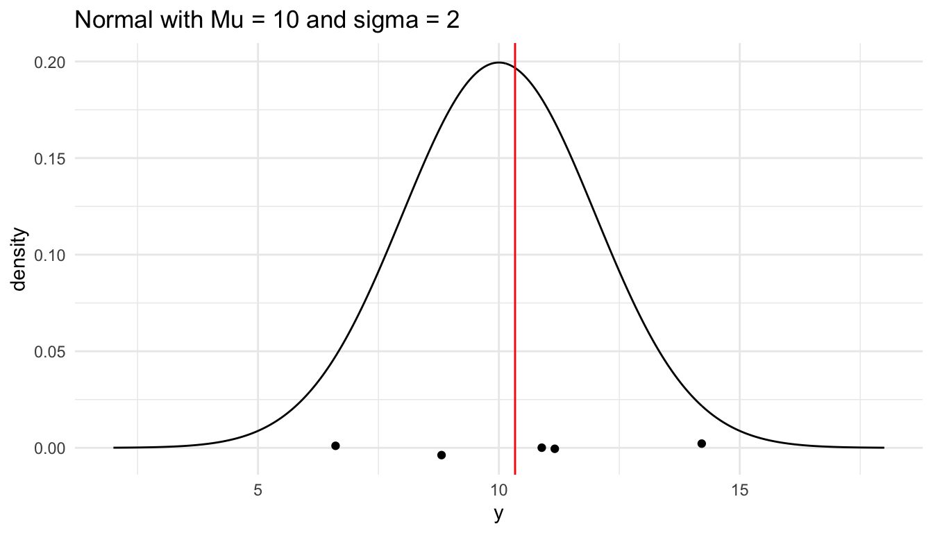
Constructing the Sampling Distribution
To simulate the sampling distribution of the sample mean from a normal population with \(\mu\) = 10 and \(\sigma\) = 2 for a sample size of 5, we need to repeat the above steps many, many, many times. We can do so by
Writing a function that computes the sample mean and then
Mapping through that function a large number of times and then
Plotting the large number of sample means to examine the characteristics of the resulting distribution.
First, let’s write the function that will compute the sample mean with a given sample size from a normal population model with a given mean and standard deviation.
n <- 5            # sample size
mu <- 10          # population mean
sigma <- 2        # population standard deviation

generate_normal_mean <- function(mu, sigma, n) {

  single_sample <- rnorm(n, mu, sigma)
  sample_mean <- mean(single_sample)

  return(sample_mean)
}

## test function once:
generate_normal_mean(mu = mu, sigma = sigma, n = n)
#> [1] 10.35405
Next, to generate 5000 sample means, we map through the function:
nsim <- 5000      # number of simulations

## code to map through the function.
## the \(i) syntax says to just repeat the generate_normal_mean function
## nsim times
means <- map_dbl(1:nsim, \(i) generate_normal_mean(mu = mu, sigma = sigma, n = n))

## print some of the 5000 means
## each number represents the sample mean from __one__ sample.
means_df <- tibble(means)
means_df
#> # A tibble: 5,000 × 1
#>   means
#>   <dbl>
#> 1 10.7
#> 2 10.1
#> 3 11.0
#> 4  9.63
#> 5 10.9
#> 6  9.17
#> # ℹ 4,994 more rows
Finally, we plot the 5000 sample means to see what our sampling distribution of the sample mean (for a sample size of 5) looks like.
ggplot(data = means_df, aes(x = means)) +
  geom_histogram(colour = "deeppink4", fill = "deeppink1", bins = 20) +
  theme_minimal() +
  labs(x = "Observed Sample Means",
       title = paste("Sampling Distribution of the \nSample Mean when n =", n))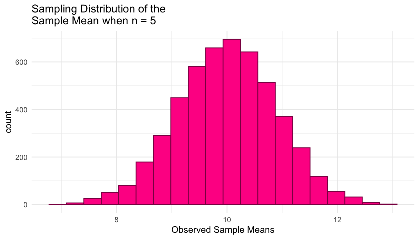
We can also obtain some summary statistics of the sampling distribution of the sample mean when \(n\) = 5:
And, we can even obtain estimates of the probability that we observe a sample mean larger than 11 by calculating the proportion of our observed sample means that are larger than 11. We can use a similar strategy to estimate the probability that we observe a sample mean less than or equal to 9.5.
# What is the probability that we observe a sample mean larger than 11?
means_df |>
  mutate(more_than_11 = if_else(means > 11,
                                true = 1, false = 0)) |>
  summarise(prob_more_than_11 = mean(more_than_11))
#> # A tibble: 1 × 1
#>   prob_more_than_11
#>               <dbl>
#> 1             0.132

# What is the probability that we observe a sample mean less than or equal to 9.5?
means_df |>
  mutate(less_9.5 = if_else(means <= 9.5,
                            true = 1, false = 0)) |>
  summarise(prob_less_9.5 = mean(less_9.5))
#> # A tibble: 1 × 1
#>   prob_less_9.5
#>           <dbl>
#> 1 0.287Exercise. Repeat the construction of the sampling distribution of the sample mean several times. How do the results change (or not)?
Exercise. Use the result from STAT 325 to report the theoretical distribution of the sample mean. Use this result to find \(P(\bar{Y}\leq 9.5)\) and \(P(\bar{Y}>11)\) analytically.
Exercise. What can we conclude about the sampling distribution of \(\bar{Y}\) when taking samples of \(n = 5\) from this population? How do the simulation results compare to the result from STAT 325? Use the plot below in your answer to this question.
theoretical_df <- tibble(xvals = seq(mu - 4 * sigma / sqrt(n),
                                     mu + 4 * sigma / sqrt(n),
                                     length.out = 500)) |>
  mutate(xvals_density = dnorm(xvals, mu, sigma / sqrt(n)))

ggplot(data = means_df, aes(x = means)) +
  geom_histogram(colour = "deeppink4", fill = "deeppink1", bins = 20,
                 aes(y = after_stat(density))) +
  theme_minimal() +
  labs(x = "Observed Sample Means",
       title = paste("Sampling Distribution of the \nSample Mean when n =", n)) +
  geom_line(data = theoretical_df, aes(x = xvals, y = xvals_density))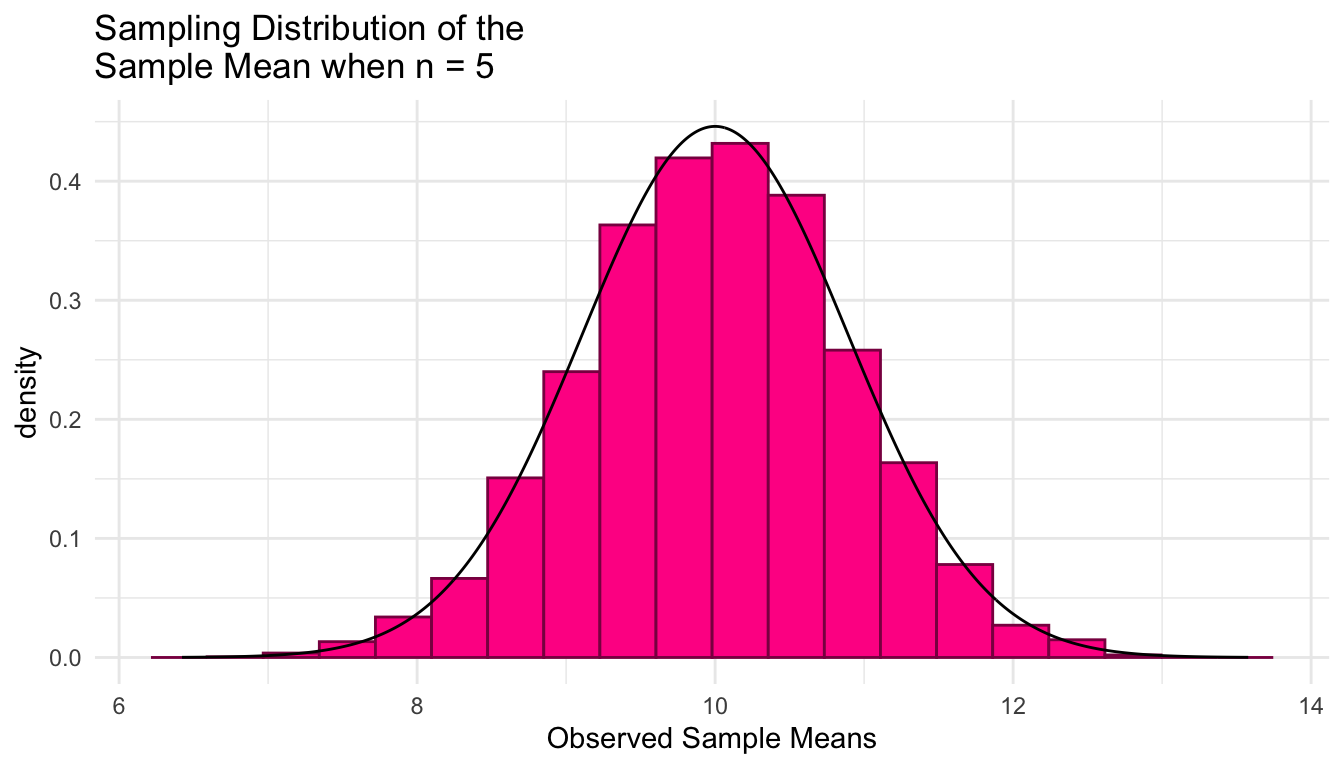
Exercise. Increase the sample size to 50 (so that Mipha is now considering the sampling distribution of the mean amount of time she spends at the office in 50 weeks) and then reconstruct the sampling distribution of the sample mean for \(n = 50\). How do the results (mean, standard deviation, and probabilities) change? Do the changes make sense and do they match the theoretical result from Stat 325?
Exercise. We mentioned that one assumption in our simulation is that each random variable is \(iid\): so, we assume that the amount time Mipha spends at the office in one week is independent of the amount of time she spends at the office in other weeks. Come up with a context for which the independence assumption might be violated in this setting.
Lab 1.2: Samp. Dist. with a Non-Normal Population
Now suppose that we can model the amount of time that Mipha walks in a day as an \(Y_i \sim\) Exponential(\(\lambda\) = 0.5) and that each \(Y_i\) is independent of other \(Y_i\). So, we have an Exponential(\(\lambda\) = 0.5) population. Using a sample size of \(n = 5\) days, continue calculating the sample mean, \(\bar{y}\). Before beginning, you should make sure to load in the tidyverse library again so that we can make some plots:
The code below modifies the code from the previous section on a normal population model to reflect the updated exponential population model. Copy the code and run it in your own R session to obtain the graph of the exponential population model with a random sample of \(n = 5\) observations.
n <- 5       # sample size
lambda <- 0.5
mu <- 1 / lambda   # population mean
sigma <- sqrt(1 / lambda ^ 2)  # population standard deviation

# generate a random sample of n observations from a normal population
single_sample <- rexp(n, lambda) |> round(2)
# look at the sample
single_sample

# compute the sample mean
sample_mean <- mean(single_sample)
# look at the sample mean
sample_mean

# generate a range of values that span the population
plot_df <- tibble(xvals = seq(0, mu + 4 * sigma, length.out = 500)) |>
  mutate(xvals_density = dexp(xvals, lambda))

## plot the population model density curve
ggplot(data = plot_df, aes(x = xvals, y = xvals_density)) +
  geom_line() +
  theme_minimal() +
  ## add the sample points from your sample
  geom_jitter(data = tibble(single_sample), aes(x = single_sample, y = 0),
              width = 0, height = 0.005) +
  ## add a line for the sample mean
  geom_vline(xintercept = sample_mean, colour = "red") +
  labs(x = "y", y = "density",
       title = "Exponential with Lambda = 0.5")
Now that we have an idea of what the population model looks like and we can generate a single sample from this model (along with the sample mean), we can repeat the generation of the sample mean thousands of times to construct the sampling distribution of the sample mean when \(n = 5\) for the exponential model.
n <- 5       # sample size
lambda <- 0.5
mu <- 1 / lambda   # population mean
sigma <- sqrt(1 / lambda ^ 2)  # population standard deviation

generate_exp_mean <- function(lambda, n) {

  single_sample <- rexp(n, lambda)
  sample_mean <- mean(single_sample)

  return(sample_mean)
}

## test function once:
generate_exp_mean(lambda = lambda, n = n)
#> [1] 1.297624

nsim <- 5000      # number of simulations

means <- map_dbl(1:nsim, \(i) generate_exp_mean(lambda = lambda, n = n))

## print some of the 5000 means
## each number represents the sample mean from __one__ sample.
means_df <- tibble(means)
means_df
#> # A tibble: 5,000 × 1
#>   means
#>   <dbl>
#> 1  3.01
#> 2  1.61
#> 3  2.08
#> 4  3.13
#> 5  1.79
#> 6  1.89
#> # ℹ 4,994 more rows

ggplot(data = means_df, aes(x = means)) +
  geom_histogram(colour = "darkolivegreen4", fill = "darkolivegreen1", bins = 20) +
  theme_minimal() +
  labs(x = "Observed Sample Means",
       title = paste("Sampling Distribution of the \nSample Mean when n =", n))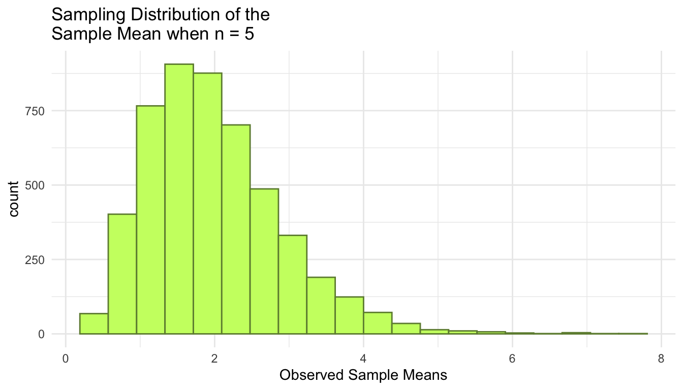
Exercise. In the code that generated the graph for the population model of the exponential distribution, along with the single sample and its mean, I modified the code from the normal distribution population model to examine a single sample from the known population, but for the Exponential population. What are some changes I made and why?
Exercise. Now look at the sampling distribution of the sample mean when \(n = 5\) for the exponential population model. Summarise what you notice about the sampling distribution of \(\bar{Y}\) when taking a sample of size \(n = 5\) from an Exponential(\(\lambda\) = 0.5) population.
Exercise. You should find that \(\text{E}(Y_i)\) and \(\text{E}(\bar{Y})\) are equal to the same value. Using the context of this example (thinking about \(Y_i\) as a random variable for Mipha’s walking time in a day, in hours), explain what the difference between \(\text{E}(Y_i)\) and \(\text{E}(\bar{Y})\) is, conceptually.
Exercise. You should find that \(\text{Var}(Y_i)\) and \(\text{Var}(\bar{Y})\) are different. Using the context of this example (thinking about \(Y_i\) as a random variable for Mipha’s walking time in a day, in hours), explain why \(\text{Var}(Y_i)\) is larger than \(\text{Var}(\bar{Y})\), conceptually.
Exercise. Increase the sample size to \(n = 50\). What do you notice about the sampling distribution of \(\bar{Y}\) now? Why has the shape of the sampling distribution changed?
Exercise. In general, what are some other ways you could summarise a sample of data? (i.e., other calculations you could do?)
Lab 1.3: Samp. Dist. of the Sample Minimum
Again, load in the tidyverse library so that we can make some plots!
Let’s return to our original context, thinking about Mipha’s weekly office time that can be modeled as: Normal(\(\mu\) = 10, \(\sigma^2\) = 4). But, now the young Mipha is interested in a different statistic: the sample minimum time she is in the office in 5 weeks. Examine the code that you ran in an earlier lab below.
n <- 5       # sample size
mu <- 10     # population mean
sigma <- 2   # population standard deviation

# generate a random sample of n observations from a normal population
single_sample <- rnorm(n, mu, sigma) |> round(2)
# look at the sample
single_sample

# compute the sample mean
sample_mean <- mean(single_sample)
# look at the sample mean
sample_mean

# generate a range of values that span the population
plot_df <- tibble(xvals = seq(mu - 4 * sigma, mu + 4 * sigma, length.out = 500)) |>
  mutate(xvals_density = dnorm(xvals, mu, sigma))

## plot the population model density curve
ggplot(data = plot_df, aes(x = xvals, y = xvals_density)) +
  geom_line() +
  theme_minimal() +
  ## add the sample points from your sample
  geom_jitter(data = tibble(single_sample), aes(x = single_sample, y = 0),
              width = 0, height = 0.005) +
  ## add a line for the sample mean
  geom_vline(xintercept = sample_mean, colour = "red") +
  labs(x = "y", y = "density",
title = "Normal with Mu = 10 and sigma = 2")Exercise. Modify the code so that, instead of calculating the sample mean as the sample statistic, you calculate the sample minimum as the sample statistic. Then, re-run the code so that you better understand what the sampling distribution of the sample minimum might look like.
Exercise. Predict what might happen next! That is, based on what you’ve seen by re-running the code above, where do you expect the center of the sampling distribution of the sample minimum to be relative to 10? Do you expect the sampling distribution of the sample minimum to overlap with the value 10 at all (if \(n = 5\)).
Exercise. Modify the code below so that you generate the sampling distribution of the sample minimum instead of the sample mean.
n <- 5            # sample size
mu <- 10          # population mean
sigma <- 2        # population standard deviation

generate_samp_mean <- function(mu, sigma, n) {

  single_sample <- rnorm(n, mu, sigma)
  sample_mean <- mean(single_sample)

  return(sample_mean)
}

## test function once:
generate_samp_mean(mu = mu, sigma = sigma, n = n)

nsim <- 5000      # number of simulations

## code to map through the function.
## the \(i) syntax says to just repeat the generate_samp_mean function
## nsim times
means <- map_dbl(1:nsim, \(i) generate_samp_mean(mu = mu, sigma = sigma, n = n))

## print some of the 5000 means
## each number represents the sample mean from __one__ sample.
means_df <- tibble(means)
means_df

ggplot(data = means_df, aes(x = means)) +
  geom_histogram(colour = "deeppink4", fill = "deeppink1", bins = 20) +
  theme_minimal() +
  labs(x = "Observed Sample Means",
       title = paste("Sampling Distribution of the \nSample Mean when n =", n))

means_df |>
  summarise(mean_samp_dist = mean(means),
            var_samp_dist = var(means),
            sd_samp_dist = sd(means))

means_df |>
  mutate(more_than_11 = if_else(means > 11,
                                true = 1, false = 0)) |>
  summarise(prob_more_than_11 = mean(more_than_11))

means_df |>
  mutate(less_9.5 = if_else(means <= 9.5,
                            true = 1, false = 0)) |>
summarise(prob_less_9.5 = mean(less_9.5))Exercise. Summarise what you notice about the sampling distribution. How does it compare to the sampling distribution of the sample mean? Does that make sense? Why or why not?
Exercise. Report the probability that the sample minimum is less than or equal to 9.5. How does it compare to the probability that the sample mean is less than or equal to 9.5? Does that make sense? Why or why not?
Exercise. Increase the sample size to 50. Summarize how the sampling distribution of the sample minimum when \(n = 50\) differs from when \(n = 5\).
Exercise. Note that the sampling distribution does not appear to be normally distributed. Do you think that if we upped the sample size to a larger value (say \(n = 1000\)), that the sampling distribution will be normally distributed? Why or why not?
Mini Project 1: Sampling Distribution of the Sample Minimum and Maximum
AI Usage: You may not use generative AI for this project in any way.
Collaboration: For this project, you may work with a self-contained group of 3. Keep in mind that you may not work with the same person on more than one mini-project (so, if you worked with a student on the first mini-project as a partner or in a small group, you may not work with that person on this project). Finally, if working with a partner or in a group of 3, you may submit the same code and the same table of results, but your write-up (both the short summary of your methods and your findings summary) must be written individually.
Statement of Integrity: At the top of your submission, copy and paste the following statement and type your name, certifying that you have followed all AI and collaboration rules for this mini-project.
“I have followed all rules for collaboration for this project, and I have not used generative AI on this project.”
On our second day of class, we conducted a simulation to investigate the sampling distribution of the sample minimum (\(Y_{min}\)) when taking samples of \(n = 5\) observations from a Normal(\(\mu = 10, \sigma^2 = 4\)) population. For your recap of that day, you investigated the sampling distribution of the sample maximum (\(Y_{max}\)) from the same population (using the same sample size).
Many of you noticed that, in this situation, SE(\(Y_{min}\)) \(\approx\) SE(\(Y_{max}\)), and many of you provided great explanations of why you thought that was true. The purpose of this mini-project assignment is for you to investigate this phenomenon to see if it is a result that holds more generally.
Instructions: Use the class code as a guide to carry out simulations of the sampling distributions of the sample minimum (\(Y_{min}\)) and the sample maximum (\(Y_{max}\)) when taking samples of size \(n = 5\) from different populations (specified below). Fill in the summary table in this document and use it answer the questions that follow.
Submission: Upload your typed up solutions to the questions that appear below, graphs (population graphs, histograms of your simulated distributions of the sample minimum, and histograms of your simulated distributions of the sample maximum), and tables showing your results, and your Quarto file to Canvas.
Below are some things that you can use to help make your graphs and table in Quarto, should you desire to use that to render a document to submit.
library(tidyverse)
## create population graphs

norm_df <- tibble(x = seq(3, 17, length.out = 1000),
                  dens = dnorm(x, mean = 10, sd = 2),
                  pop = "normal(10, 4)")
unif_df <- tibble(x = seq(7, 13, length.out = 1000),
                  dens = dunif(x, 7, 13),
                  pop = "uniform(7, 13)")
exp_df <- tibble(x = seq(0, 10, length.out = 1000),
                 dens = dexp(x, 0.5),
                 pop = "exp(0.5)")
beta_df <- tibble(x = seq(0, 1, length.out = 1000),
                  dens = dbeta(x, 8, 2),
                  pop = "beta(8, 2)")

pop_plot <- bind_rows(norm_df, unif_df, exp_df, beta_df) |>
  mutate(pop = fct_relevel(pop, c("normal(10, 4)", "uniform(7, 13)",
                                  "exp(0.5)", "beta(8, 2)")))

ggplot(data = pop_plot, aes(x = x, y = dens)) +
  geom_line() +
  theme_minimal() +
  facet_wrap(~ pop, nrow = 1, scales = "free") +
  labs(title = "Population Distributions for Each Simulation Setting")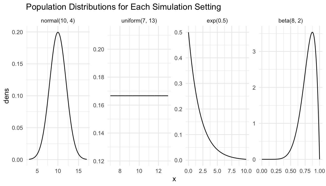
If creating your report in Quarto, you can use a similar strategy as above to show your 4 histograms of the simulated distribution of the sample minimum and to again show your 4 histograms of the simulated distribution of the sample maximum.
In addition to your graphs, you should also complete the following table:
| \(\text{N}(\mu = 10, \sigma^2 = 4)\) | \(\text{Unif}(\theta_1 = 7, \theta_2 = 13)\) | \(\text{Exp}(\lambda = 0.5)\) | \(\text{Beta}(\alpha = 8, \beta = 2)\) | |
|---|---|---|---|---|
| \(\text{E}(Y_{min})\) | ||||
| \(\text{E}(Y_{max})\) | ||||
| \(\text{SE}(Y_{min})\) | ||||
| \(\text{SE}(Y_{max})\) |
Below is the Quarto text used to generate the table above:
|  |  $\text{N}(\mu = 10, \sigma^2 = 4)$  | $\text{Unif}(\theta_1 = 7, \theta_2 = 13)$ | $\text{Exp}(\lambda = 0.5)$ | $\text{Beta}(\alpha = 8, \beta = 2)$ |
|:----:|:-----------------:|:-------------:|:------------:|:------------:|
| $\text{E}(Y_{min})$    |       |        |       |              |
| $\text{E}(Y_{max})$    |       |        |       |              |
|                        |       |        |       |              |
| $\text{SE}(Y_{min})$   |       |        |       |              |
| $\text{SE}(Y_{max})$   |       |        |       |              |
: Table of Results {.striped .hover}
Finally, in addition to your code, graphs, and table, you should answer the following questions:
Briefly summarise how \(\text{SE}(Y_{min})\) and \(\text{SE}(Y_{max})\) compare for each of the above population models. Can you propose a general rule or result for how \(\text{SE}(Y_{min})\) and \(\text{SE}(Y_{max})\) compare for a given population?
Choose either the third (Exponential) or fourth (Beta) population model from the table above. For that population model, find the pdf of \(Y_{min}\) and \(Y_{max}\), and, for each of those random variables, sketch the pdfs and use integration to calculate the expected value and standard error. What do you notice about how your answers compare to the simulated answers? Some code is given below to help you plot the pdfs in
R:
n <- 5
## CHANGE 0 and 3 to represent where you want your graph to start and end
## on the x-axis
x <- seq(0, 3, length.out = 1000)
## CHANGE to be the pdf you calculated. Note that, as of now,
## this is not a proper density (it does not integrate to 1).
density <- n * exp(-(1/2) * x)


## put into tibble and plot
samp_min_df <- tibble(x, density)
ggplot(data = samp_min_df, aes(x = x, y = density)) +
  geom_line() +
  theme_minimal()