library(tidyverse)
library(here)
polls <- read_csv(here("data/rcp-polls.csv"), na = "--")
polls
#> # A tibble: 7 × 8
#>   Poll             Date  Sample   MoE `Clinton (D)` `Trump (R)` `Johnson (L)`
#>   <chr>            <chr> <chr>  <dbl>         <dbl>       <dbl>         <dbl>
#> 1 Monmouth         7/14… 688 LV   3.7            45          43             5
#> 2 CNN/ORC          7/13… 872 RV   3.5            42          37            13
#> 3 ABC News/Wash P… 7/11… 816 RV   4              42          38             8
#> 4 NBC News/Wall S… 7/9 … 1000 …   3.1            41          35            11
#> 5 Economist/YouGov 7/9 … 932 RV   4.5            40          37             5
#> 6 Associated Pres… 7/7 … 837 RV  NA              40          36             6
#> # ℹ 1 more row
#> # ℹ 1 more variable: `Stein (G)` <dbl>6 Tidying with tidyr
Goals:
describe what it means for a data set to be tidy.
use
separate()andunite()to transform a data set into tidy form.use
pivot_longer()andpivot_wider()to transform a data set into tidy form.combine
tidyrfunctions withdplyrandggplot2functions to form a more complete workflow.
The Data: We will first use a polling data set that contains variables collected from a few different polls in July 2016 for the U.S. presidential election. The data set was scraped from RealClear politics https://www.realclearpolitics.com/epolls/latest_polls/president/ by Dr. Ramler. The variables are:
-
Poll, the name of the poll -
Date, the date range that the poll was conducted -
Sample, contains the sample size of the poll and whether the poll was of Likely Voters or Registered Voters -
MoE, the margin of error of the poll (recall this term from IntroStat) -
Clinton (D), the percentage of people in the poll voting for Clinton -
Trump (R), the percentage of people in the poll voting for Trump -
Johnson (L), the percentage of people in the poll voting for Johnson -
Steing (G), the percentage of people in the poll voting for Stein
6.1 What is Tidy Data?
R usually (but not always) works best when your data is in tidy form. A tidy data set has a few characteristics.
NoteNote
You should already be quite familiar with tidy data because, up to this point, all of the data sets we have used in this class (and probably most of the data sets that you see in STAT 113 an all of the data sets that you may have seen in STAT 213) are tidy.
The definition of tidy data below is taken from R for Data Science:
- every variable in the data set is stored in its own column
- every case in the data set is stored in its own row
- each value of a variable is stored in one cell
- values in the data set should not contain units
- there should not be any table headers or footnotes
We will begin by focusing on the first characteristic: every variable in a the data set should be stored in its own column (and correspondingly, number 3: each value of a variable should be stored in one cell).
6.2 separate() and unite() Columns
In a fresh .qmd file (File -> New File -> Quarto) that is in your Notes project, copy and paste the following code into an R chunk:
Suppose that you wanted to know what the average sample size of the polls was. Using dplyr functions,
What warning do you get? Why?
You would get a similar warning (or sometimes an error) any time that you want to try to use Sample size in plotting or summaries. The issue is that the Sample column actually contains two variables so the data set is not tidy.
6.2.1 separate() a Column
Let’s separate() the Sample column into Sample_size and Sample_type:
polls |>
  separate(col = Sample, into = c("Sample_size", "Sample_type"),
           sep = " ")
#> # A tibble: 7 × 9
#>   Poll          Date  Sample_size Sample_type   MoE `Clinton (D)` `Trump (R)`
#>   <chr>         <chr> <chr>       <chr>       <dbl>         <dbl>       <dbl>
#> 1 Monmouth      7/14… 688         LV            3.7            45          43
#> 2 CNN/ORC       7/13… 872         RV            3.5            42          37
#> 3 ABC News/Was… 7/11… 816         RV            4              42          38
#> 4 NBC News/Wal… 7/9 … 1000        RV            3.1            41          35
#> 5 Economist/Yo… 7/9 … 932         RV            4.5            40          37
#> 6 Associated P… 7/7 … 837         RV           NA              40          36
#> # ℹ 1 more row
#> # ℹ 2 more variables: `Johnson (L)` <dbl>, `Stein (G)` <dbl>
The arguments to separate() are fairly easy to learn:
colis the name of the column in the data set you want to separate.intois the name of the new columns. These could be anything you want, and are entered in as a vector (withc()to separate the names)sepis the character that you want to separate the column by. In this case, the sample size and sample type were separated by whitespace, so oursep = " ", white space.
The sep argument is the newest piece of information here.
Note that even using sep = "" will produce an error (there is not a space now, so R doesn’t know what to separate by):
Similarly, we would like the Date column to be separated into a poll start date and a poll end date:
6.2.2 unite() Columns
unite() is the “opposite” of separate(): use it when one variable is stored across multiple columns, but each row still represents a single case. The need to use unite() is less common than separate(). In our current data set, there is no need to use it at all. But, for the sake of seeing an example, let’s separate the Start date into month and day and then use unite() to re-unite those columns:
polls_sillytest <- polls_sep |>
  separate(col = Start, into = c("Start_month", "Start_day"),
           sep = "/")
polls_sillytest
#> # A tibble: 7 × 10
#>   Poll     Start_month Start_day End   Sample   MoE `Clinton (D)` `Trump (R)`
#>   <chr>    <chr>       <chr>     <chr> <chr>  <dbl>         <dbl>       <dbl>
#> 1 Monmouth 7           14        7/16  688 LV   3.7            45          43
#> 2 CNN/ORC  7           13        7/16  872 RV   3.5            42          37
#> 3 ABC New… 7           11        7/14  816 RV   4              42          38
#> 4 NBC New… 7           9         7/13  1000 …   3.1            41          35
#> 5 Economi… 7           9         7/11  932 RV   4.5            40          37
#> 6 Associa… 7           7         7/11  837 RV  NA              40          36
#> # ℹ 1 more row
#> # ℹ 2 more variables: `Johnson (L)` <dbl>, `Stein (G)` <dbl>
This situation could occur in practice: for example, the date variable may be in multiple columns, one for month and one for day (and if there are multiple years, there could be a third for year). We would use unite() to combine these two columns into a single Date, called New_start_date:
polls_sillytest |>
  unite("New_start_date", c(Start_month, Start_day),
        sep = "/")
#> # A tibble: 7 × 9
#>   Poll            New_start_date End   Sample   MoE `Clinton (D)` `Trump (R)`
#>   <chr>           <chr>          <chr> <chr>  <dbl>         <dbl>       <dbl>
#> 1 Monmouth        7/14           7/16  688 LV   3.7            45          43
#> 2 CNN/ORC         7/13           7/16  872 RV   3.5            42          37
#> 3 ABC News/Wash … 7/11           7/14  816 RV   4              42          38
#> 4 NBC News/Wall … 7/9            7/13  1000 …   3.1            41          35
#> 5 Economist/YouG… 7/9            7/11  932 RV   4.5            40          37
#> 6 Associated Pre… 7/7            7/11  837 RV  NA              40          36
#> # ℹ 1 more row
#> # ℹ 2 more variables: `Johnson (L)` <dbl>, `Stein (G)` <dbl>
NoteNote
unite() just switches around the first two arguments of separate(). Argument 1 is now the name of the new column and Argument 2 is the names of columns in the data set that you want to combine.
We have also used the c() function in separate() and unite(). While c() is a very general R function and isn’t specific to tidy data, this is the first time that we’re seeing it in this course. c() officially stands for concatenate, but, in simpler terms, c() combines two or more “things”, separated by a comma.
This is useful if a function argument expects two or more “things”: for example, in separate(), the into argument requires two column names for this example. Those column names must be specified by combining the names together with c().
6.2.3 Column Names and rename()
You might have noticed that the columns with percentage of votes for Clinton, Trump, etc. are surrounded by backticks ` ` when you print polls or polls_sep:
polls_sep
#> # A tibble: 7 × 9
#>   Poll       Start End   Sample   MoE `Clinton (D)` `Trump (R)` `Johnson (L)`
#>   <chr>      <chr> <chr> <chr>  <dbl>         <dbl>       <dbl>         <dbl>
#> 1 Monmouth   7/14  7/16  688 LV   3.7            45          43             5
#> 2 CNN/ORC    7/13  7/16  872 RV   3.5            42          37            13
#> 3 ABC News/… 7/11  7/14  816 RV   4              42          38             8
#> 4 NBC News/… 7/9   7/13  1000 …   3.1            41          35            11
#> 5 Economist… 7/9   7/11  932 RV   4.5            40          37             5
#> 6 Associate… 7/7   7/11  837 RV  NA              40          36             6
#> # ℹ 1 more row
#> # ℹ 1 more variable: `Stein (G)` <dbl>
This happens because the column names have a space in them (this also would occur if the columns started with a number or had odd special characters in them). Then, any time you want to reference a variable, you need the include the backticks:
Having variable names with spaces doesn’t technically violate any principle of tidy data, but it can be quite annoying. Always using backticks can be a huge pain. We can rename variables easily with rename(), which just takes a series of new_name = old_name arguments.
polls_new <- polls_sep |>
  rename(Clinton_D = `Clinton (D)`, Trump_R = `Trump (R)`,
         Johnson_L = `Johnson (L)`, Stein_G = `Stein (G)`)
polls_new
#> # A tibble: 7 × 9
#>   Poll           Start End   Sample   MoE Clinton_D Trump_R Johnson_L Stein_G
#>   <chr>          <chr> <chr> <chr>  <dbl>     <dbl>   <dbl>     <dbl>   <dbl>
#> 1 Monmouth       7/14  7/16  688 LV   3.7        45      43         5       1
#> 2 CNN/ORC        7/13  7/16  872 RV   3.5        42      37        13       5
#> 3 ABC News/Wash… 7/11  7/14  816 RV   4          42      38         8       5
#> 4 NBC News/Wall… 7/9   7/13  1000 …   3.1        41      35        11       6
#> 5 Economist/You… 7/9   7/11  932 RV   4.5        40      37         5       2
#> 6 Associated Pr… 7/7   7/11  837 RV  NA          40      36         6       2
#> # ℹ 1 more row
rename() can also be very useful if you have variable names that are very long to type out.
NoteNote
rename() is actually from dplyr, not tidyr, but we did not have a need for it with any of the dplyr data sets.
In the following exercises, use the toy data set to practice with separate() and unite().
toy_df <- tibble::tibble(show = c("Bojack Horseman: Netflix",
                                  "VEEP: HBO",
                                  "American Vandal: Netflix",
                                  "Community: Peacock"),
                         seasons = c("1-6", "1-7", "1-2", "1-6"),
                         main_first = c("Bojack", "Selina", "Peter", "Jeff"),
                         main_last = c("Horseman", "Meyer", "Molganado", "Winger"))
toy_df
#> # A tibble: 4 × 4
#>   show                     seasons main_first main_last
#>   <chr>                    <chr>   <chr>      <chr>
#> 1 Bojack Horseman: Netflix 1-6     Bojack     Horseman
#> 2 VEEP: HBO                1-7     Selina     Meyer
#> 3 American Vandal: Netflix 1-2     Peter      Molganado
#> 4 Community: Peacock       1-6     Jeff       Winger
Exercise 1. separate() the show variable into a column that has the TV show name and a column that has the name of the network.
Exercise 2. separate() the seasons variable into a column that has the starting season and a column that has the ending season.
Exercise 3. unite() the main_first and main_last columns into a new column that gives the full name of the main character, with their first and last names separated by a single space.
6.3 Reshaping with pivot_()
We will continue to use the polling data set to introduce the pivoting functions and data reshaping. To make sure that we are all working with the same data set, run the following line of code:
The data set polls_clean still isn’t tidy!! The candidate variable is spread out over 4 different columns and the values in each of these 4 columns actually represent 1 variable: poll percentage.
Thinking about data “tidyness” using the definitions above can sometimes be a little bit confusing. In practice, oftentimes we will usually realize that a data set is untidy when we go to do something that should be super simple but that something turns out to not be super simple at all when the data is in its current form.
For example, one thing we might want to do is to make a plot that has poll Start time on the x-axis, polling numbers on the y-axis, and has candidates represented by different colours. For this small data set, we might not see any trends through time, but you could imagine this graph would be quite useful if we had polling numbers through June, July, August, September, etc.
Take a moment to think about how you would make this graph in ggplot2: what is your x-axis variable? What variable are you specifying for the y-axis? For the colours?
A first attempt in making a graph would be:
ggplot(data = polls_clean, aes(x = Start, y = Clinton_D)) +
  geom_point(aes(colour = ....??????????))
And we’re stuck. It’s certainly not impossible to make the graph with the data in its current form (keep adding geom_point() and re-specifying the aesthetics, then manually specify colours, then manually specify a legend), but it’s definitely a huge pain.
This is where pivot_longer() can help! https://www.youtube.com/watch?v=8w3wmQAMoxQ
6.3.1 pivot_longer() to Gather Columns
pivot_longer() “pivots” the data set so that is has more rows (hence the “longer”) by collapsing multiple columns into two columns. One new column is a “key” column, which is the new variable containing the old data set’s column names. The second new column is a “value” column, which is the new variable containing the old data set’s values for each of the old data set’s column names. It’s easier to see this with an example. We know from our plotting exercise above that we’d really like a candidate variable to colour by and a poll_percent variable for the y-axis of our plot. So, we can use pivot_longer() to make these two columns:
polls_clean |>
  pivot_longer(cols = c(Clinton_D, Trump_R, Johnson_L, Stein_G),
               names_to = "candidate", values_to = "poll_percent")
#> # A tibble: 28 × 8
#>   Poll     Start End   Sample_size Sample_type   MoE candidate poll_percent
#>   <chr>    <chr> <chr> <chr>       <chr>       <dbl> <chr>            <dbl>
#> 1 Monmouth 7/14  7/16  688         LV            3.7 Clinton_D           45
#> 2 Monmouth 7/14  7/16  688         LV            3.7 Trump_R             43
#> 3 Monmouth 7/14  7/16  688         LV            3.7 Johnson_L            5
#> 4 Monmouth 7/14  7/16  688         LV            3.7 Stein_G              1
#> 5 CNN/ORC  7/13  7/16  872         RV            3.5 Clinton_D           42
#> 6 CNN/ORC  7/13  7/16  872         RV            3.5 Trump_R             37
#> # ℹ 22 more rows
pivot_longer() has three important arguments:
-
cols, the names of the columns that you want to PIVOT! -
names_to, the name of the new variable that will have the old column names (anything you want it to be!) -
values_to, the name of the new variable that will have the old column values (anything you want it to be!)
Now we can make our plot using ggplot functions. But don’t forget to give a name to our new “long” data set first!
polls_long <- polls_clean |>
  pivot_longer(cols = c(Clinton_D, Trump_R, Johnson_L, Stein_G),
               names_to = "candidate", values_to = "poll_percent")

## ignore as.Date for now....we will get to dates later!
ggplot(data = polls_long,
       aes(x = as.Date(Start, "%m/%d"), y = poll_percent,
           colour = candidate)) +
  geom_point() + labs(x = "Poll Start Date")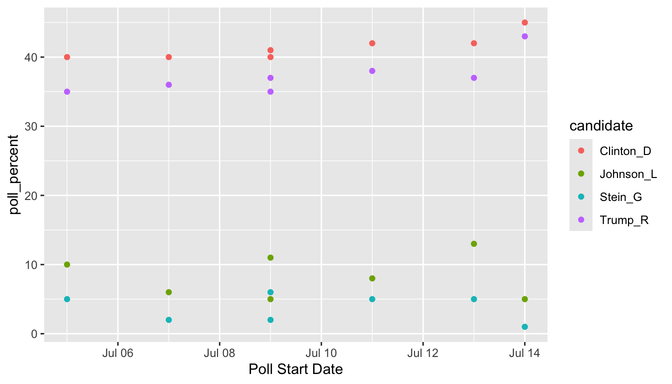
6.3.2 pivot_wider() to Spread to Multiple Columns
The “opposite” of pivot_longer() is pivot_wider(). We need to use pivot_wider() when one case is actually spread across multiple rows. pivot_wider() has two main arguments:
-
names_from, the column in the old data set that will provide the names of the new columns and -
values_from, the column in the old data set that will provide the values that fill in the new columns
One common use case of pivot_wider() is the creation of a contingency table from summarised data. For example, suppose that, from the STAT 113 survey data, we have
stat113_df <- read_csv(here::here("data/stat113.csv"))
stat113_sum <- stat113_df |> filter(!is.na(Sex)) |> group_by(Year, Sex) |>
  summarise(n_students = n())
stat113_sum
#> # A tibble: 8 × 3
#> # Groups:   Year [4]
#>   Year      Sex   n_students
#>   <chr>     <chr>      <int>
#> 1 FirstYear F             90
#> 2 FirstYear M             84
#> 3 Junior    F             15
#> 4 Junior    M             18
#> 5 Senior    F              3
#> 6 Senior    M             10
#> # ℹ 2 more rows
We want to make a two-way (contingency) table of the number of students that has Sex on the rows and Year on the columns. pivot_wider() can put the levels of the Year variable as new columns in the data frame:
stat113_sum |> pivot_wider(names_from = Year, values_from = n_students)
#> # A tibble: 2 × 5
#>   Sex   FirstYear Junior Senior Sophomore
#>   <chr>     <int>  <int>  <int>     <int>
#> 1 F            90     15      3       100
#> 2 M            84     18     10        76
We will see more examples of pivot_wider() and pivot_longer() in the Exercises.
ImportantImportant
Tidy data isn’t necessarily always better: you might find cases where you need to “untidy” the data by using pivot_longer() or pivot_wider(). However, most functions in R (and in other languages) work best with tidy data.
NoteNote
There are a few more topics to discuss in tidying data. We have not yet discussed the 4th or 5th characteristics of tidy data (cells should not contain units and there should be no headers or footers), but these are usually dealt with when we read in the data. Therefore, these issues will be covered when we discuss readr.
Exercise 4. With the stat113_df data, construct a table showing the average GPA (without missing GPA values) for each Sex-Sport combination. Then, pivot the table so that the columns are the levels of Sport and the rows are the levels of Sex.
TipHint (only if you get stuck)
To create the (unpivoted) table, you will need to use group_by() and summarise(), adding in an na.rm = TRUE argument to summarise().
Exercise 5. Suppose that you have the following data set that has the number of deaths from a disease for various years in different locations.
Pivot the data set so that there is a single column that gives the year and a single column that gives the death count.
6.4 Practice
6.4.1 Class Exercises
Class Exercise 1. Once you have a handle on data science terminology, it’s not too difficult to transfer what you’ve learned to a different language. For example, students in computer science might be more familiar with Python. Google something like “pivot from wide to long in python” to find help on achieving the equivalent of pivot_longer() in Python.
Class Exercise 2. The UBSprices2 data set contains information on prices of common commodities in cities throughout the world in the years 2003 and 2009. The three commodities in the data set are Rice (1 kg worth), Bread (1 kg worth), and a Big Mac https://media1.giphy.com/media/Fw5LicDKem6nC/source.gif. Read in the data set and explain why, in its current form, the data is not tidy.
Class Exercise 3. Construct a plot that allows you to see how the price of rice has changed in between 2003 and 2009 for each of the cities in the data set.
Class Exercise 4. Construct a plot that allows you to see how the price of each of the three commodities has changed between 2003 and 2009 for the city of Amsterdam.
New Data:
The under5mortality.csv file contains data on mortality for people under the age of 5 in countries around the world (mortality in deaths per 1000 people). The data come from https://www.gapminder.org/data/. The data set is extremely wide in its current form, having a column for each year in the data set. Read in the data set with
mortality_df <- read_csv(here("data/under5mortality.csv"))
mortality_df
#> # A tibble: 275 × 217
#>   `Under five mortality` `1800` `1801` `1802` `1803` `1804` `1805` `1806`
#>   <chr>                   <dbl>  <dbl>  <dbl>  <dbl>  <dbl>  <dbl>  <dbl>
#> 1 Abkhazia                  NA     NA     NA     NA     NA     NA     NA
#> 2 Afghanistan              469.   469.   469.   469.   469.   469.   470.
#> 3 Akrotiri and Dhekelia     NA     NA     NA     NA     NA     NA     NA
#> 4 Albania                  375.   375.   375.   375.   375.   375.   375.
#> 5 Algeria                  460.   460.   460.   460.   460.   460.   460.
#> 6 American Samoa            NA     NA     NA     NA     NA     NA     NA
#> # ℹ 269 more rows
#> # ℹ 209 more variables: `1807` <dbl>, `1808` <dbl>, `1809` <dbl>,
#> #   `1810` <dbl>, `1811` <dbl>, `1812` <dbl>, `1813` <dbl>, `1814` <dbl>,
#> #   `1815` <dbl>, `1816` <dbl>, `1817` <dbl>, `1818` <dbl>, `1819` <dbl>,
#> #   `1820` <dbl>, `1821` <dbl>, `1822` <dbl>, `1823` <dbl>, `1824` <dbl>,
#> #   `1825` <dbl>, `1826` <dbl>, `1827` <dbl>, `1828` <dbl>, `1829` <dbl>,
#> #   `1830` <dbl>, `1831` <dbl>, `1832` <dbl>, `1833` <dbl>, `1834` <dbl>, …
Class Exercise 5. Notice that there are 217 columns (at the top of the print out of the header, 217 is the second number). When we use tidyr, we aren’t going to want to type out c(2, 3, 4, 5, .....) all the way up to 217! R has short-hand notation that we can use with :. For example, type in 4:9 in your console window. Use this notation to tidy the mortality_df data set.
NoteNote
You’ll need to add something to your pivot_longer() function to convert the variable name_of_your_year_variable to numeric. We haven’t talked about variable types yet so, but you will need to change the variable type of your year variable to numeric. After pivoting, pipe into a |> mutate(name_of_your_year_variable = as.numeric(name_of_your_year_variable)) to change your year variable type to numeric.
Class Exercise 6. Construct a plot to look at the overall under 5 mortality trends for each country.
Class Exercise 7. What is the overall trend in under 5 mortality? Does every single country follow this trend? What looks strange about the plot, specifically about the data collected before 1900?
6.4.2 Your Turn
The MLB salary data set contains salaries on all 862 players in Major League Baseball in 2016. The data set was obtained from http://www.usatoday.com/sports/mlb/salaries/2016/player/all/
Your Turn 1. Read in the data using the following code chunk and, with your group, write a sentence or two that explains why the data set is not tidy.
library(tidyverse)
library(here)
baseball_df <- read_csv(here("data/mlb2016.csv"))
baseball_df
#> # A tibble: 862 × 7
#>   Name             Team  POS   Salary       Years      Total.Value Avg.Annual
#>   <chr>            <chr> <chr> <chr>        <chr>      <chr>       <chr>
#> 1 Clayton Kershaw  LAD   SP    $ 33,000,000 7 (2014-2… $ 215,000,… $ 30,714,…
#> 2 Zack Greinke     ARI   SP    $ 31,799,030 6 (2016-2… $ 206,500,… $ 34,416,…
#> 3 David Price      BOS   SP    $ 30,000,000 7 (2016-2… $ 217,000,… $ 31,000,…
#> 4 Miguel Cabrera   DET   1B    $ 28,000,000 10 (2014-… $ 292,000,… $ 29,200,…
#> 5 Justin Verlander DET   SP    $ 28,000,000 7 (2013-1… $ 180,000,… $ 25,714,…
#> 6 Yoenis Cespedes  NYM   CF    $ 27,328,046 3 (2016-1… $ 75,000,0… $ 25,000,…
#> # ℹ 856 more rows
glimpse(baseball_df)
#> Rows: 862
#> Columns: 7
#> $ Name        <chr> "Clayton Kershaw", "Zack Greinke", "David Price", "Migu…
#> $ Team        <chr> "LAD", "ARI", "BOS", "DET", "DET", "NYM", "SEA", "LAA",…
#> $ POS         <chr> "SP", "SP", "SP", "1B", "SP", "CF", "SP", "1B", "SP", "…
#> $ Salary      <chr> "$ 33,000,000", "$ 31,799,030", "$ 30,000,000", "$ 28,0…
#> $ Years       <chr> "7 (2014-20)", "6 (2016-21)", "7 (2016-22)", "10 (2014-…
#> $ Total.Value <chr> "$ 215,000,000", "$ 206,500,000", "$ 217,000,000", "$ 2…
#> $ Avg.Annual  <chr> "$ 30,714,286", "$ 34,416,666", "$ 31,000,000", "$ 29,2…
Your Turn 2. Tidy the data set just so that
-
Durationof the salary contract (currently given in theYearcolumn) is in its own column. - the year range (also currently given in the
Yearcolumn) is split into a variable calledStartand a variable calledEndyear that give the start and end years of the contract. You can still have special characters for now (like(and)) in the start and end year.
Your Turn 3. You should have received a warning message. What does this message mean? See if you can figure it out by typing View(baseball_df) in your console window and scrolling down to some of the rows that the warning mentions: 48, 59, 60, etc. With your group, explain why that warning message was given.
Your Turn 4. We won’t learn about parse_number() until readr, but the function is straightforward enough to mention here. It’s useful when you have extra characters in the values of a numeric variable (like a $ or a (), but you just want to grab the actual number:
baseball_tidy <- name_of_your_baseball_data |>
  mutate(Salary = parse_number(Salary),
         Total.Value = parse_number(Total.Value),
         Avg.Annual = parse_number(Avg.Annual),
         Start = parse_number(Start),
         End = parse_number(End))
Run the code above so that the parsing is saved to baseball_tidy.
Your Turn 5. With a partner, brainstorm 2 different graphics you could construct to investigate how player Salary compares for players with different POS. Each of you should make 1 of the graphics you discussed. Then, state the reason why making that plot would not have worked before we tidied the data set.
New Data: For the rest of the exercises, we will use salary data from the National Football League obtained from FiveThirtyEight that were originally obtained from Spotrac.com.
The data set has the top 100 paid players for each year for each position from 2011 through 2018, broken down by player position. For those unfamiliar with American football, the positions in the data set are Quarterback, Running Back, Wide Receiver, Tight End, and Offensive Lineman for offense, Cornerback, Defensive Lineman, Linebacker, and Safety for Defense, and a separate category for Special Teams players that includes punters and kickers. You can review a summary of player positions here.
We are interested in how salaries compare for the top 100 players in each position and on how salaries have changed through time for each position.
Read in the data set with
Your Turn 6. Explain why this data set is not in tidy form.
Your Turn 7. Tidy the data set and give your tidied data set a new name.
CautionCuation
The following exercises are a bit more challenging. Even though they are “Your Turn” exercises, we will discuss them a bit as a class as well.
Your Turn 8. Construct a graph that lets you explore how the maximum salary for each position has changed over time.
Your Turn 9. What is one flaw about using the maximum salary for each position as our metric for “change” over time. What other metric might we use instead? Re-construct the graph with this other metric?
Your Turn 10. Sometimes for graphs involving cost or salary, we want to take into account the inflation rate. Google what the inflation rate was between 2011 and 2018 (Google something like “inflation rate from 2011 to 2018” and you should be able to find something). Adjust all of the 2011 salaries for inflation so that they are comparable to the 2018 salaries.
Your Turn 11. Construct a graph that shows the salary depreciation from top paid players in each position to lesser paid players in each position for the year 2018 only. Which position has the largest depreciation?